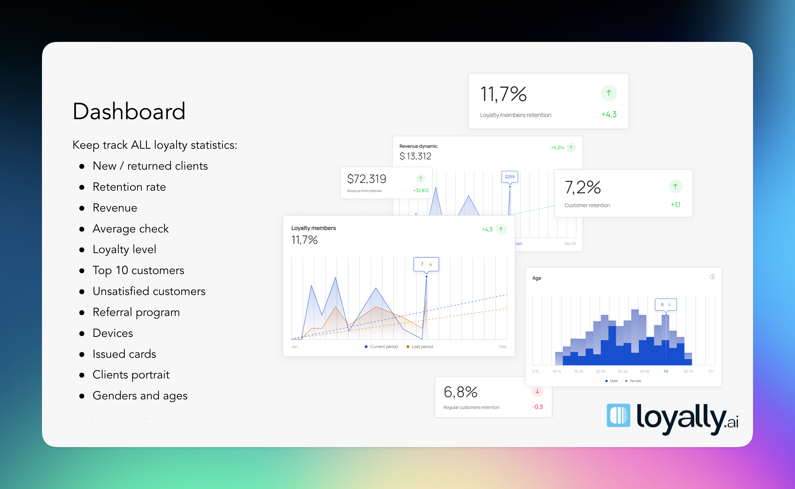
Navigating the main dashboard and available actions.
The 'Dashboard' page shows you important statistics about your business performance.
Information is categorized into:
Finance
Visits
Performance
Program members
Reputation management
Customer segments (RFM)
Points analytics
Referral analytics
Real timeline
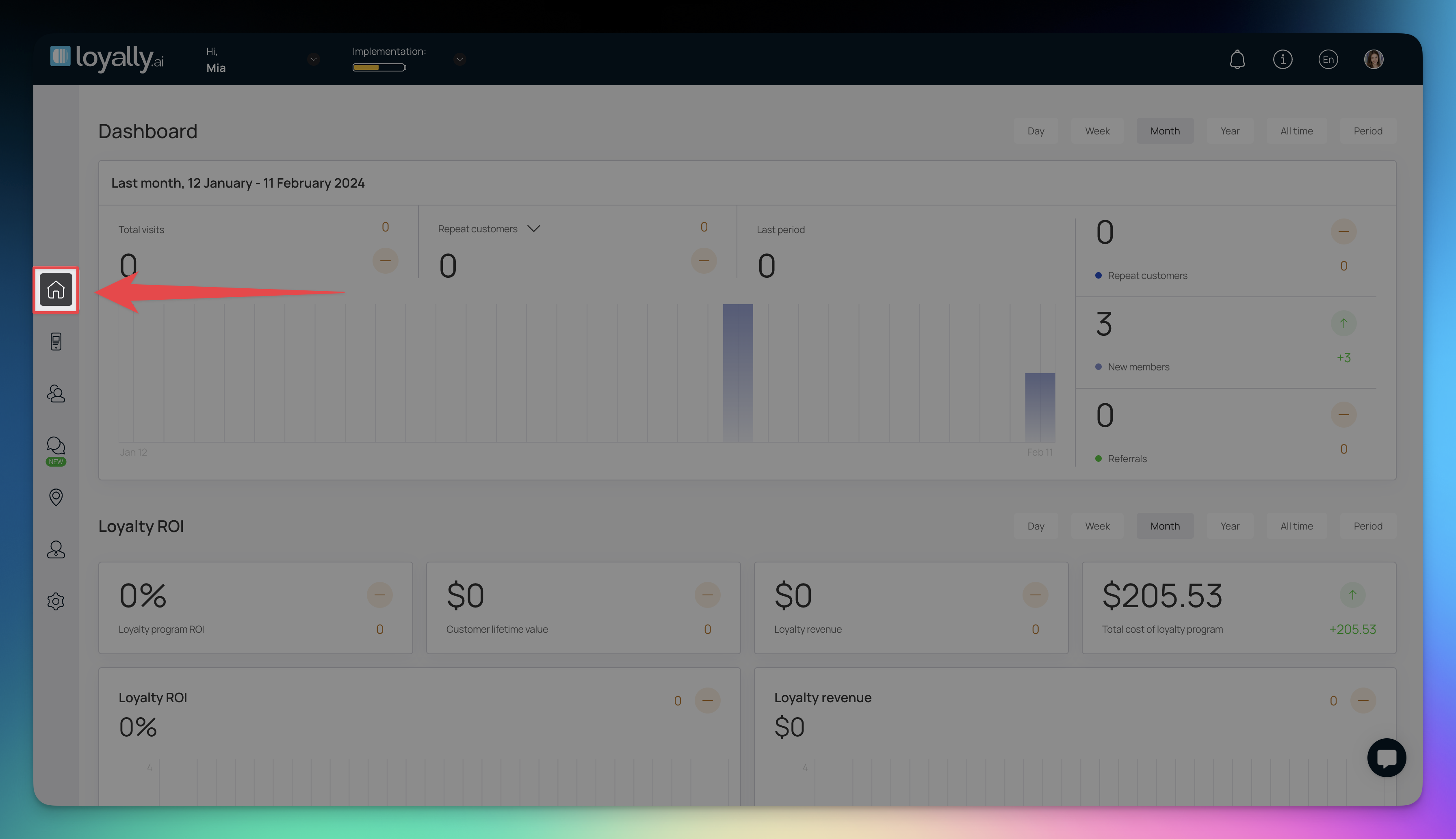
You can toggle between different dashboard versions to see the data in a format that works best for you:
New: The updated, modern interface designed for clarity and a quick summary of key metrics.
Old: A legacy view for users who prefer the original dashboard layout.

The date filters allow you to pinpoint exactly when your revenue and engagement occurred. Choosing a specific timeframe will automatically update all the numbers and charts on the page:
Today: Check in on real-time performance for the current day.
Last 7 days: A great way to spot weekly patterns or the impact of a recent promotion.
Last 4 weeks: Provides a broader look at monthly growth and customer retention.
Last 6 months: Ideal for identifying seasonal shifts in your business.
Last 12 months: Use this for a high-level overview of your annual performance.
Month to date: Tracks your progress from the first of the current month up to today.
Period: Allows you to select a custom date range for a specific campaign or event.
By default, the time period is set to Week. However, you can change it to Day, Month, Year, All Time, and Period (Custom Range) using the action buttons on the top-right corner.

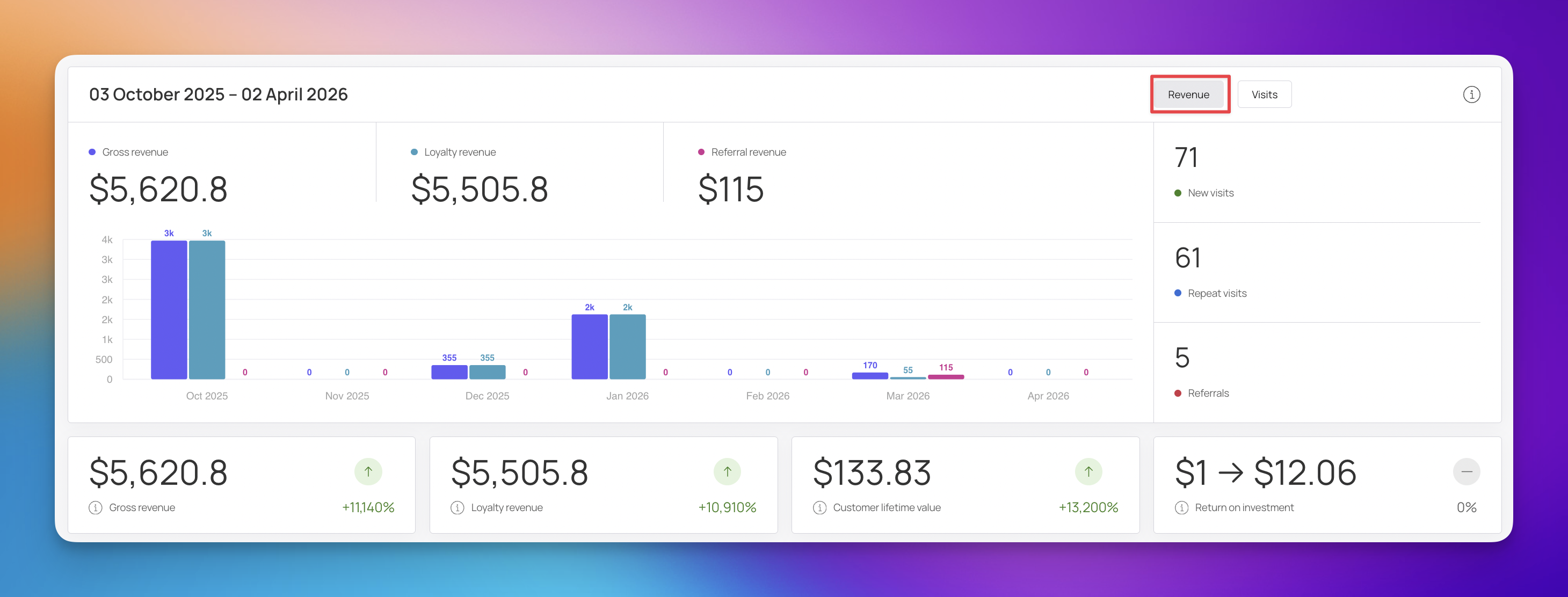
The top of the dashboard provides a high-level summary of your business data, giving you a quick look at how things are performing over a specific timeframe. In this example, the data covers the period from October 3, 2025, to April 2, 2026. While you can toggle this section to view Visits data, the default view focuses on Revenue to help you track your earnings immediately.
When the Revenue toggle is active, the dashboard highlights where your income is coming from. This is perfect for seeing how much value your marketing efforts are actually driving.
Gross Revenue ($5,620.80): This is your total income from all sources during the period. You’ll notice a green arrow with +11,140%, showing a massive jump compared to your previous timeframe.
Loyalty Revenue ($5,505.80): This tracks money spent by customers in your loyalty program. It clearly shows that the majority of your revenue is coming from your loyal fan base.
Referral Revenue ($115.00): This specifically tracks sales generated from customer referrals.
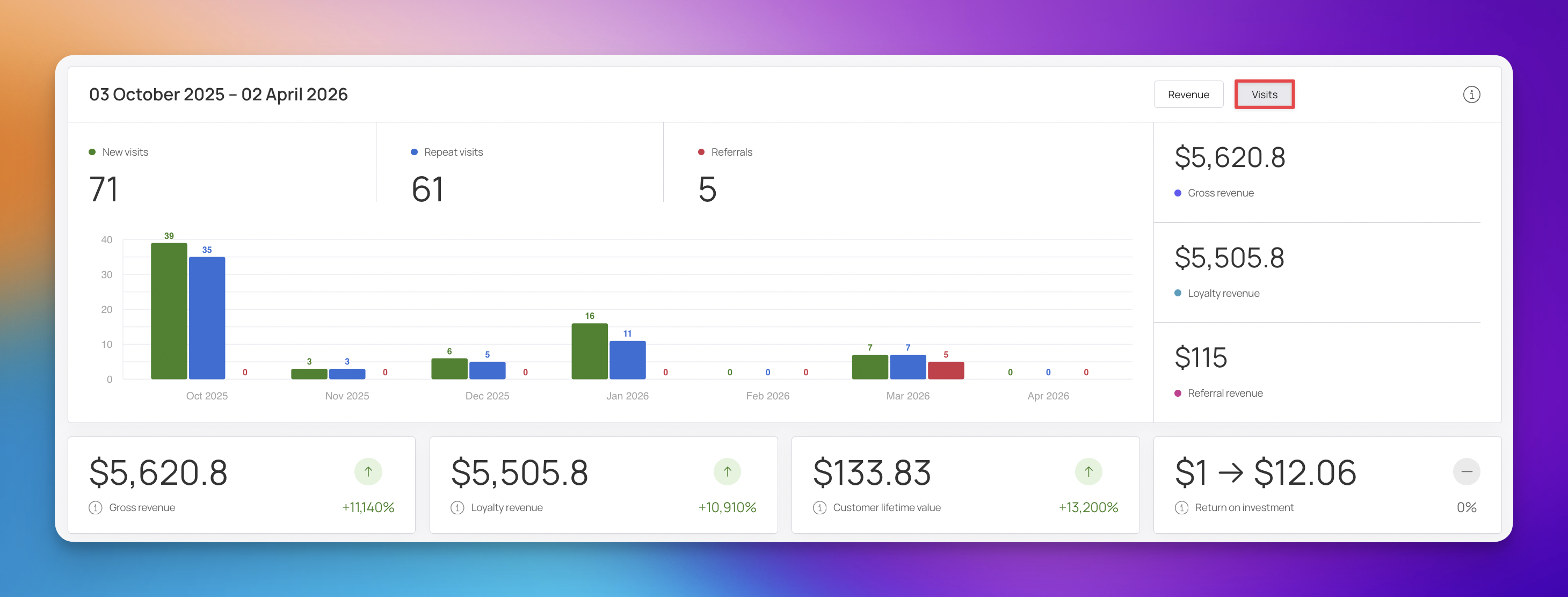
If you switch the toggle to Visits, the dashboard shifts to focus on customer activity and traffic volume.
New Visits (71): The number of unique, first-time customers who checked out your business.
Repeat Visits (61): This tracks returning customers, which is a great indicator of how well you're retaining your audience.
Referrals (5): The total number of people who were referred to your business by others.
The Finance section provides a granular look at the money moving through your loyalty and referral programs. By breaking down exactly where your revenue comes from and weighing it against your costs, you can see the clear financial impact of your marketing efforts.
This area identifies exactly which customer segments are driving your sales.
Repeated Members Revenue ($0): This tracks earnings from regular customers who were already members of your loyalty program before the current period. It’s calculated by taking your total loyalty revenue and subtracting revenue from unknown customers.
New Members Revenue ($5,620.80): This shows the income from customers who joined your loyalty program for the first time during this timeframe. It’s a vital metric for evaluating how well you are attracting new participants.
Referral Members Revenue ($115.00): This reflects the effectiveness of your "word of mouth" marketing by tracking purchases made through referral links.
Unknown Customers Revenue ($0): This tracks sales from customers who are not yet part of your loyalty or referral programs.
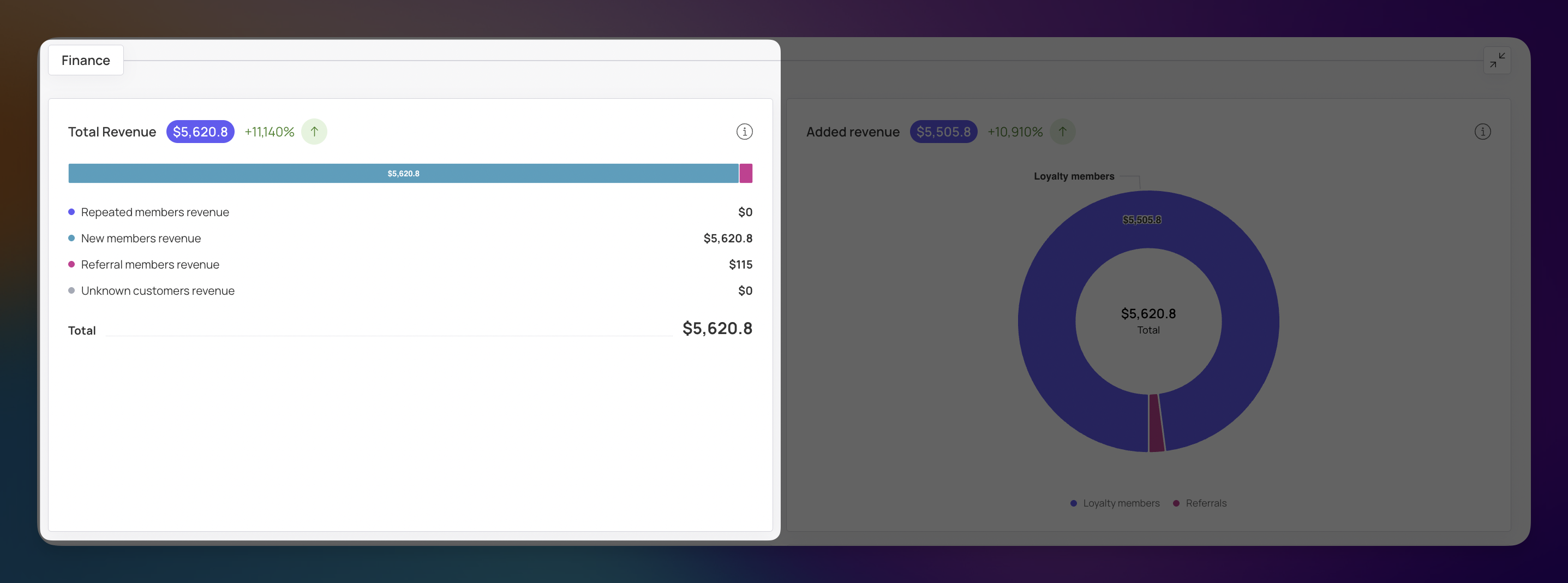

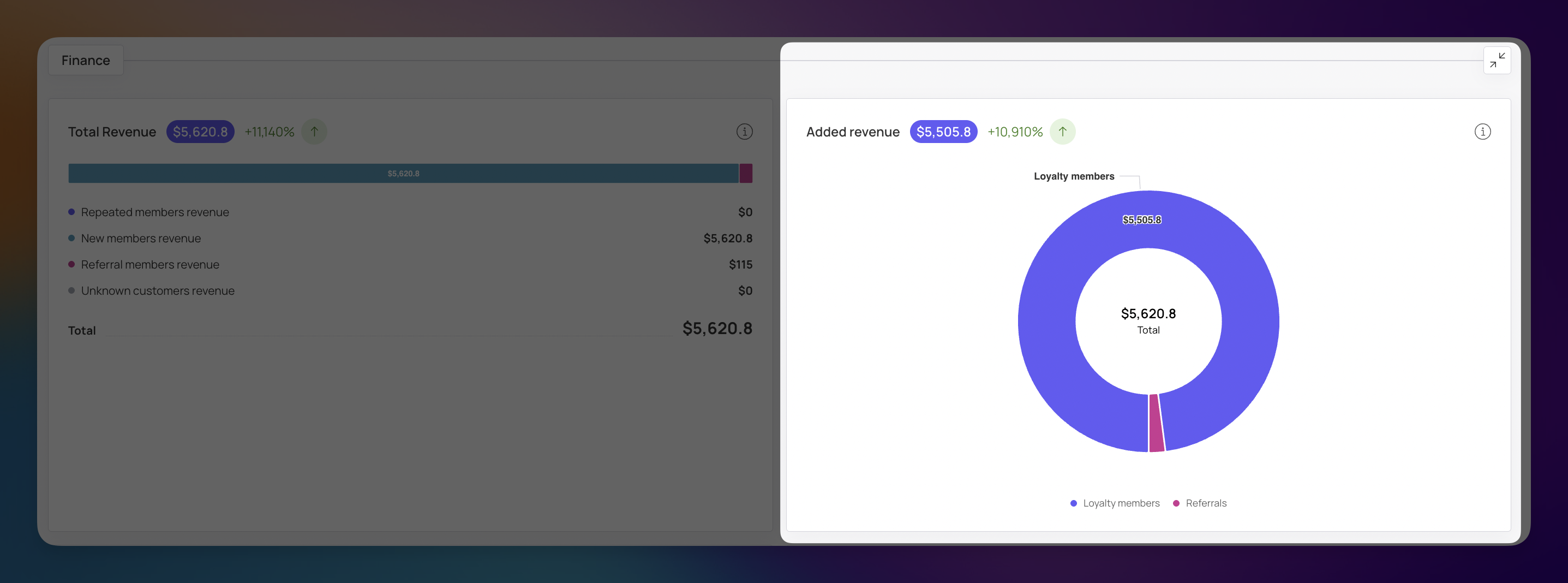
Added Revenue represents the total "extra" income specifically generated by your loyalty and referral systems. This is a key indicator of your program’s success in boosting your bottom line.
Formula: $Loyalty Revenue + Referral Revenue = Added Revenue$
Loyalty Members ($5,505.80): This highlights the value of retention by showing the total spend from all program participants.
Referrals ($115.00): This shows the direct financial benefit of your referral system.

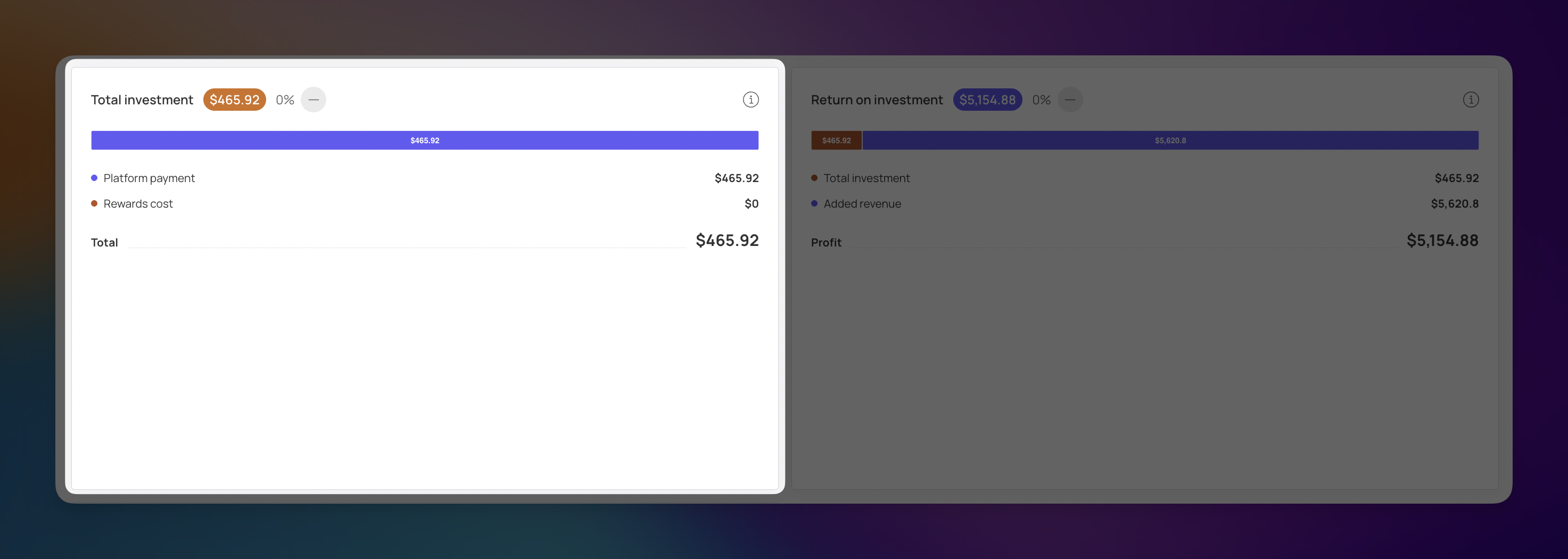
To understand your true profit, the dashboard tracks your "Total Investment," which is the sum of what you spend to keep the program running.
Formula: $Platform Payments + Rewards Cost = Total Investment$
Platform Payment ($465.92): These are your regular, fixed costs for using the loyalty platform.
Rewards Cost ($0): This tracks the expenses related to providing customer rewards and referral bonuses.

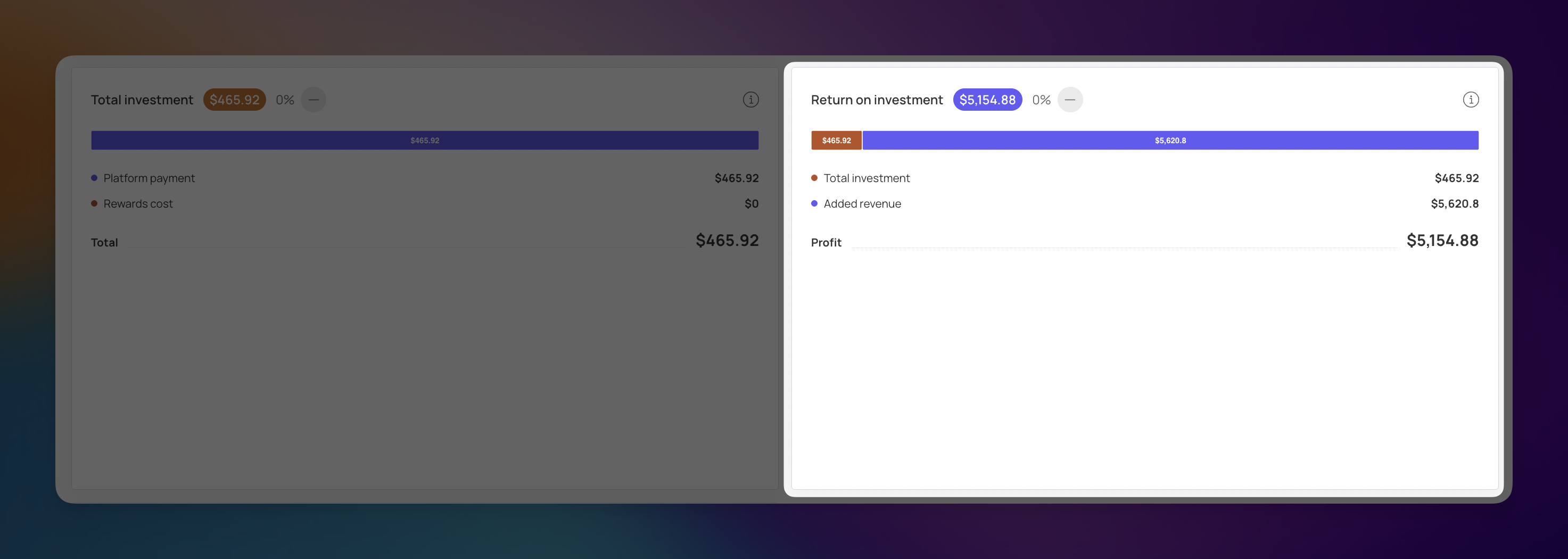
The bottom line of the Finance section is your Profit. This figure tells you the actual financial result of your programs after all costs have been deducted. A positive value here confirms that your programs are profitable.
Formula: $Added Revenue - Total Investment = Profit$
In this example, your Added Revenue ($5,620.80) minus your Total Investment ($465.92) results in a total Profit of $5,154.88.
Revenue (Added Income): Demonstrates the direct financial benefit of your marketing programs.
Total Investment: Shows exactly how much you are investing to develop customer loyalty.
The Average Order Value (AOV) section provides a clear visual comparison between how much loyalty members spend versus non-members. This helps you understand if your rewards program is successfully encouraging customers to add more to their carts each time they shop. The bar chart breaks down spending habits into two distinct categories:
Loyalty Program Members: This tracks the average transaction amount for customers enrolled in your loyalty program. In this example, you can see high peaks of $135.50 and $133.40 in December and January, indicating that members spent significantly more during those months.
Customers Outside the Loyalty Program (Non-loyalty members): This serves as your "baseline" or control group. It tracks the average check for customers who are not part of any rewards program. Comparing this to your member data helps you see the "purchasing power gap" between your two audiences.
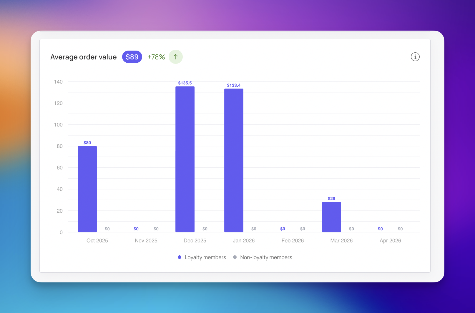
Identify High-Value Periods: By looking at the monthly breakdown, you can see which seasonal promotions or rewards pushed your AOV higher (like the $89 average shown at the top, which is a +78% increase).
Measure Program Influence: If the loyalty members bars are consistently taller than the non-loyalty member bars it proves that your loyalty program is effectively driving higher spending per visit.

The Visits tab provides a deeper dive into how customer traffic translates into financial results. It features four key metrics that offer an immediate health check of business performance during the selected period:
Total Visits (71): This represents the total number of customer interactions. Every visit is counted here, including repeat visits by the same customers.
Total Revenue ($5,620.80): The total dollar amount generated from all visits during the selected timeframe.
Active Clients (24): This tracks the number of unique customers who made at least one visit during the selected period. Unlike the total number of visits, each customer is counted only once, regardless of how many times they visited.
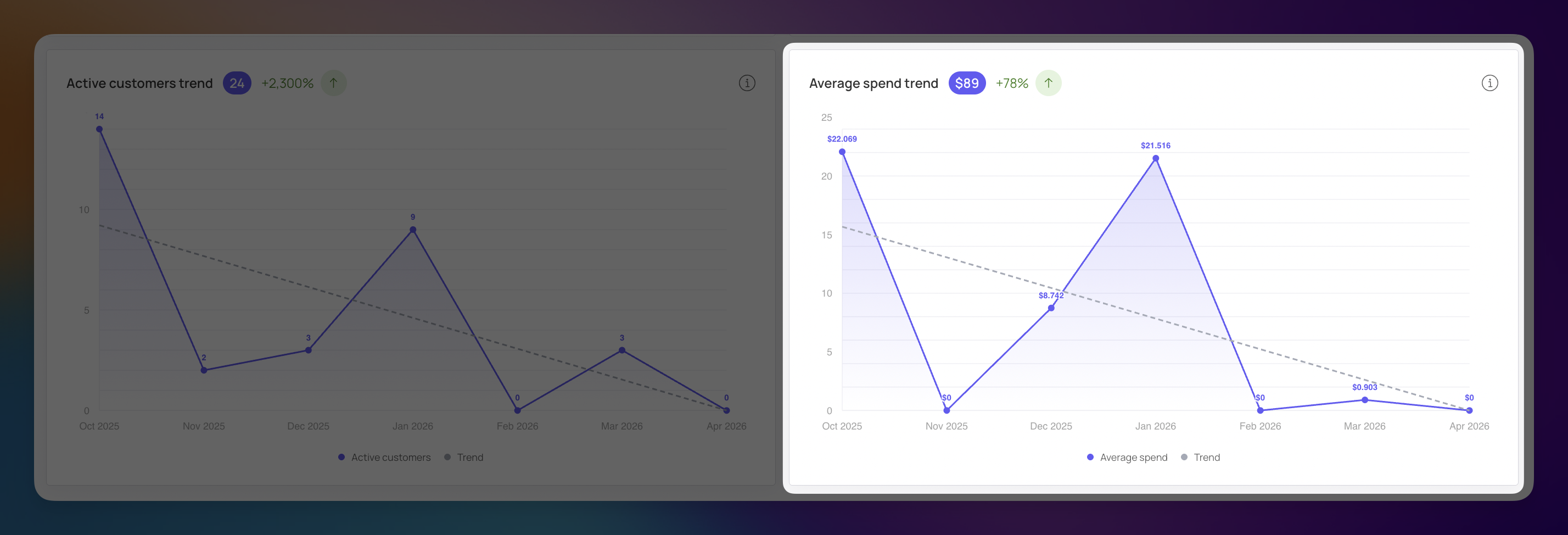
Average Spend ($89): This is the average amount spent by a single unique customer during the period. It is calculated by dividing your total revenue by the number of unique customers.

This chart visualizes the flow of traffic over time, helping you identify when your business is most visible to your audience.
Activity Peaks: The solid line shows the specific number of visits at any given point. For instance, the data shows a high point of 39 visits in October 2025.
The Trend Line: The dotted line represents the long-term trajectory. This is vital for seeing past daily fluctuations to understand if your audience size is growing or shrinking overall.
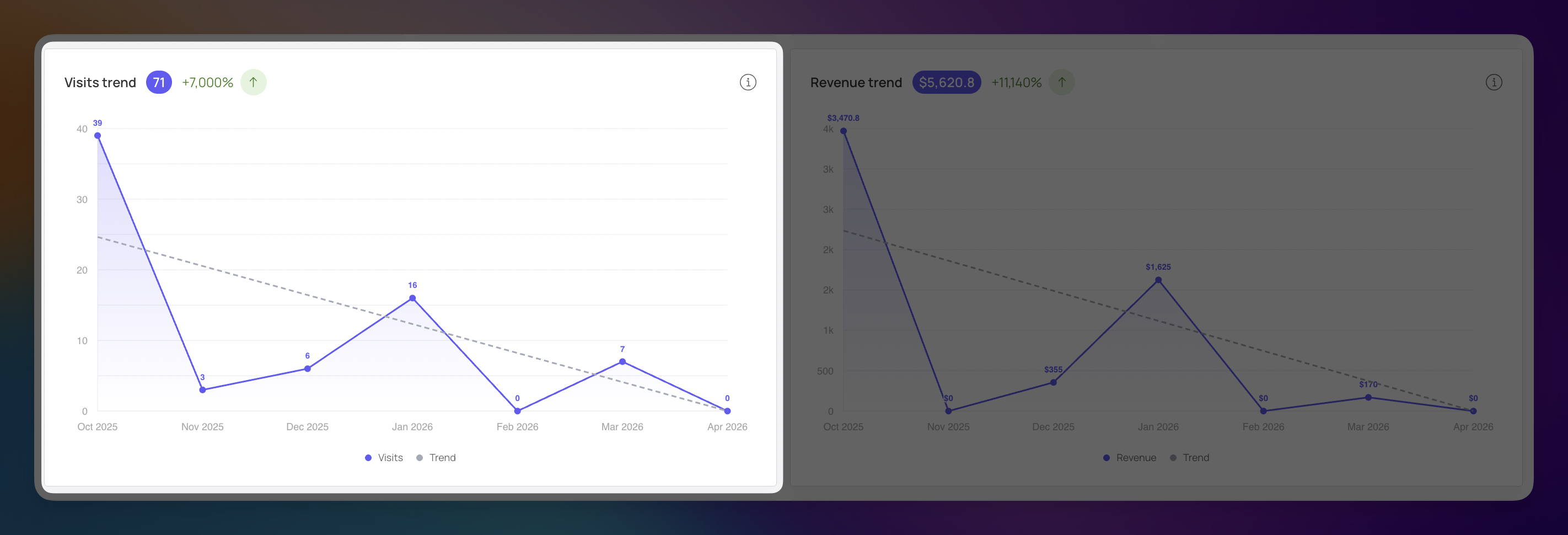
This chart mirrors the visit patterns but displays the actual monetary value generated during those same intervals.
Financial Impact: This allows you to see how much money was earned at specific points. In October 2025, the traffic peak resulted in $3,470.80 in revenue.
Correlation Tracking: By comparing the shape of this line to the Visits chart, you can determine if your traffic is "high quality." If the revenue line peaks in sync with the visits line, your marketing is successfully reaching customers who are ready to buy.
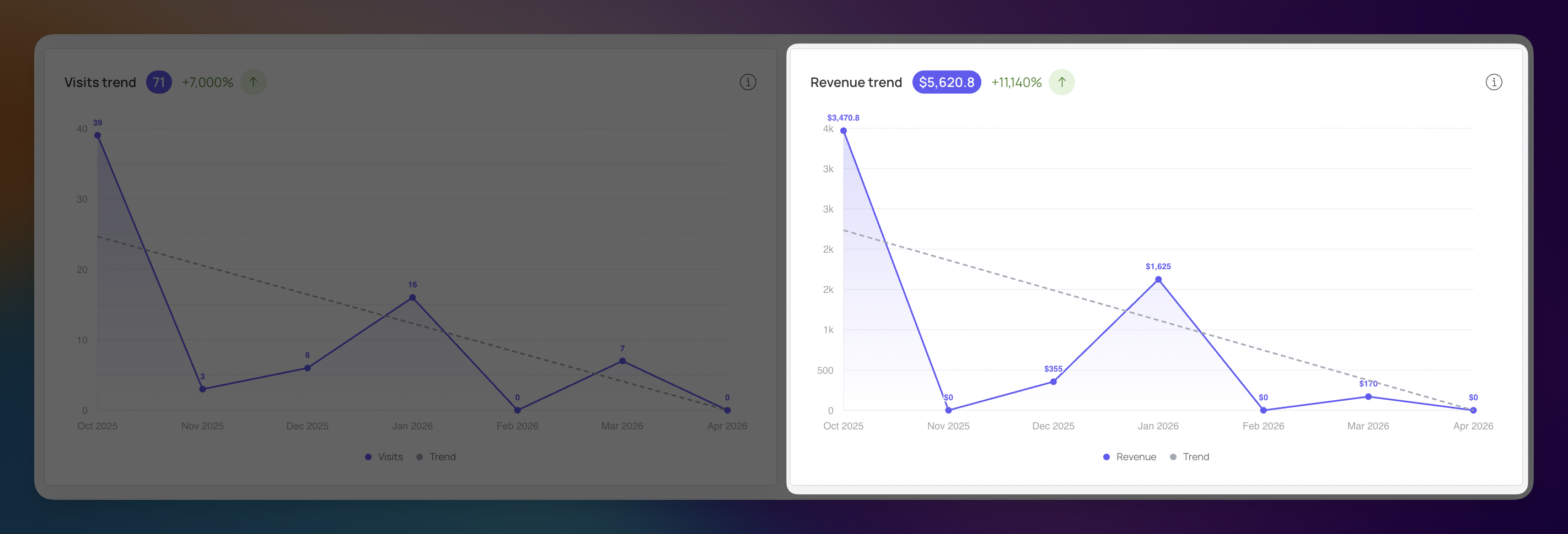
This chart tracks the number of unique individuals who interacted with your business over time. It helps you see if you are building a consistent audience or relying on one-time surges.
Participation Levels: The solid line shows the specific count of active customers. For example, there were 14 unique customers in October 2025 and a secondary peak of 9 in January 2026.
Engagement Growth: The header shows a total of 24 active clients for the period, which is an impressive +2,300% increase from the previous timeframe.
The Trend Line: The dotted line indicates whether your base of active users is expanding or contracting over the long haul.
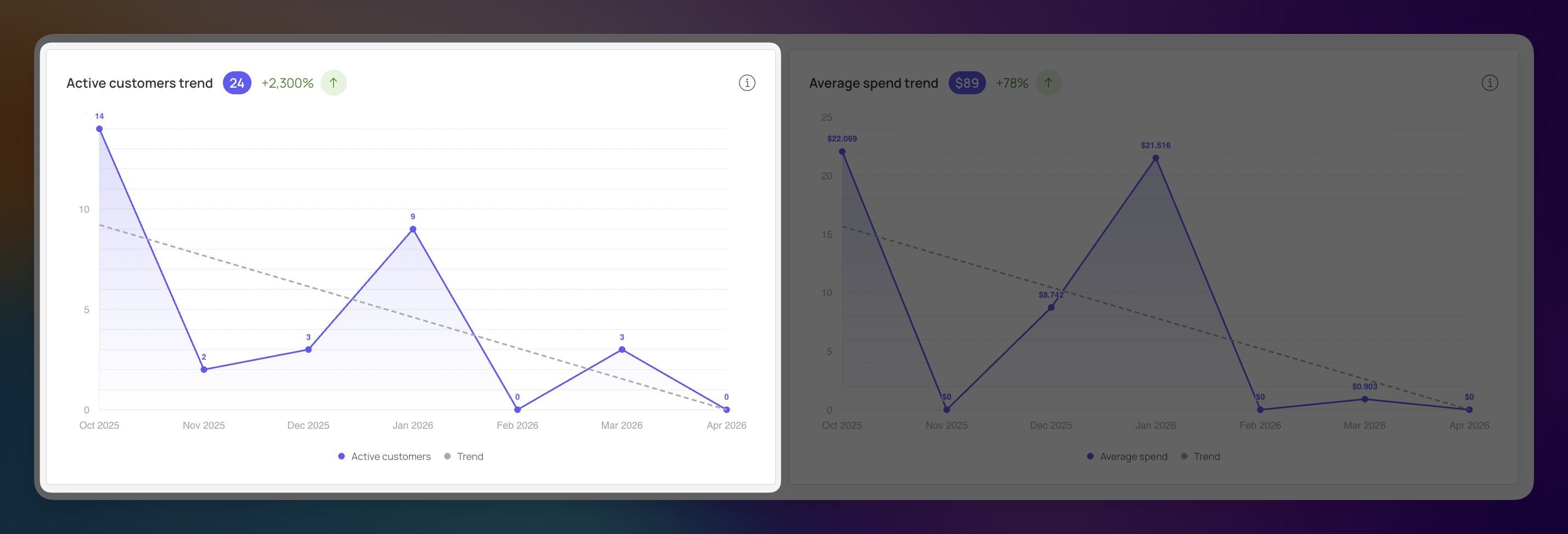
This chart visualizes the average transaction value per customer. It answers the question: "When customers show up, how much are they actually buying?"
Spending Patterns: The solid line tracks fluctuations in order value. While October 2025 saw a strong start, January 2026 showed another significant increase in how much customers were willing to spend.
Overall Average: The header displays the period's average spend of $89, representing a +78% improvement in purchasing power.
The Trend Line: Much like the activity chart, the dotted line here helps you see if your customers are gradually spending more or less per visit over time.
The Performance section moves beyond raw numbers to show how effectively you are keeping your customers engaged. By tracking how many people stay active and when they choose to interact with your business, you can identify the strengths and weaknesses of your current loyalty strategy.
Enrollment Rate (86.05%): This represents the percentage of your total customer base that made at least one visit during the selected period. It is a direct reflection of what proportion of your audience remains active. A decline here is a primary signal that you may be losing customers.
Formula: (ActiveCustomers/TotalNumberofCustomers)×100%=EnrollmentRate
Engagement Rate (55.81%): This metric measures the intensity of customer activity. Unlike enrollment, it accounts for the frequency of visits, a customer who visits five times impacts this score more than a customer who visits once.
Formula: (UniqueVisits/TotalNumberofCustomers)×100%=EngagementRate
Churn Rate (100%): This identifies the percentage of customers who were active in the previous period but did not make a single visit in the current one. A high churn rate is a warning sign of retention issues.
Formula: (CustomersLost/ActiveCustomersinPreviousPeriod)×100%=ChurnR
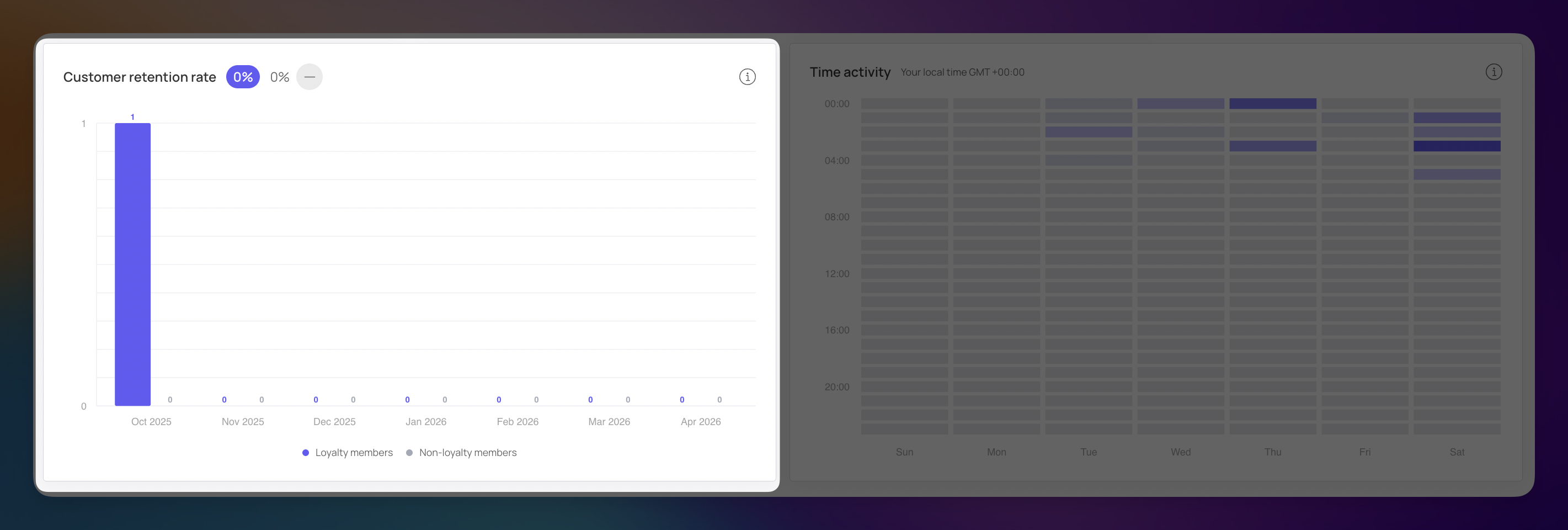
This chart visualizes how many members are sticking with your program over time compared to non-members. In the example, a clear peak in October 2025 shows a high concentration of loyalty member activity that didn't carry over into subsequent months.
Loyalty vs. Non-Loyalty: The chart separates participants into two groups. In the example, a clear peak in October 2025 shows a strong concentration of activity from loyalty members.
Long-Term Trends: By watching these bars month-over-month, you can see if your retention efforts are consistent or if customers are only returning during specific holiday sales.
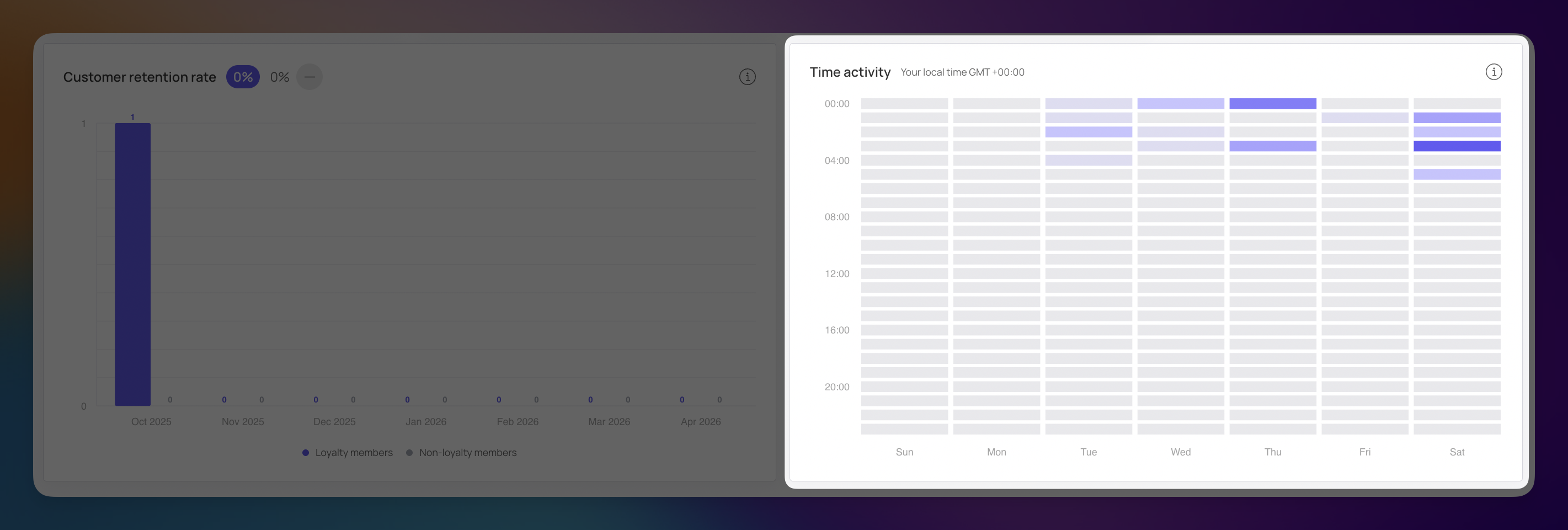
The Time Activity map provides a visual distribution of customer visits by the hour and day of the week. This is a powerful tool for understanding the "when" behind your customer behavior.
Peak Activity Identification: The graph shows the specific times and days when your customers are most active. Darker or more saturated blocks indicate higher traffic, while lighter areas represent quiet periods.
Strategic Optimization: Use this information to optimize your work schedule, plan your biggest promotions, and allocate staff or resources to the hours that matter most.

The Program Members section focuses on how your loyalty community is expanding and which platforms your customers prefer for managing their digital cards. This information helps you understand the effectiveness of your recruitment efforts and technical accessibility.
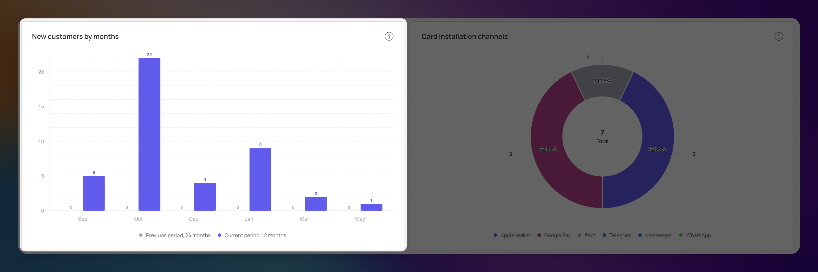
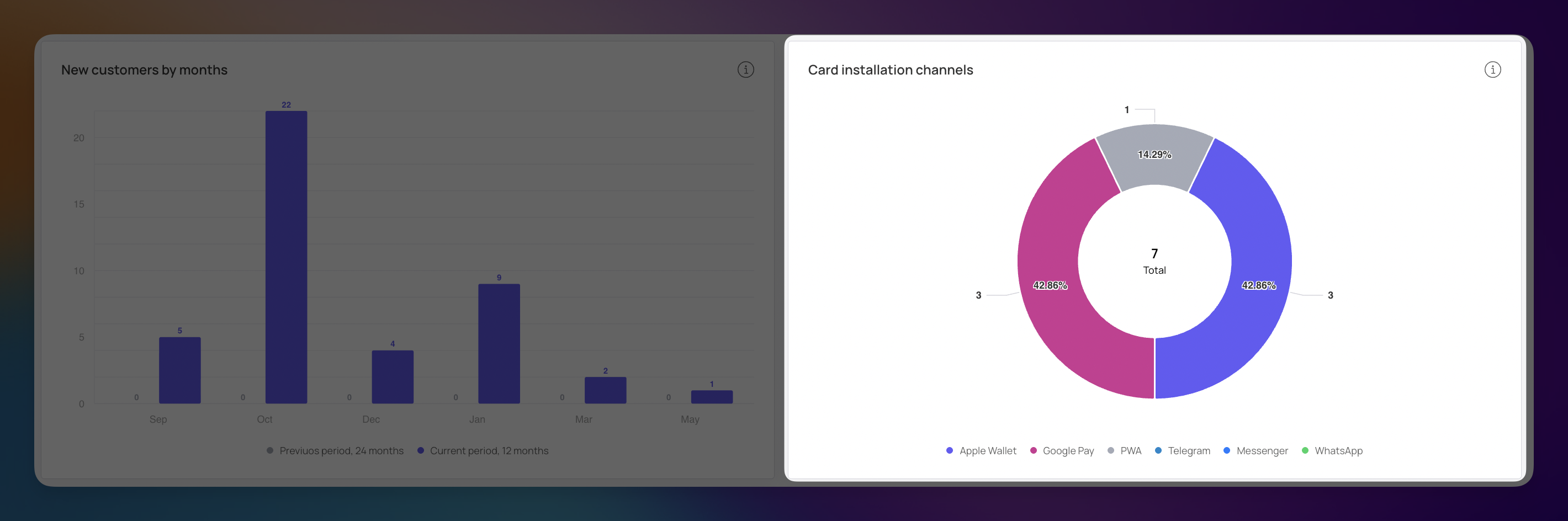
This bar chart provides a comparison of the number of new customers by month for the current and previous years.
Analyzing Seasonality: By looking at the monthly breakdown such as the peak of 22 new members in October you can analyze the seasonality of your new customer inflow.
Tracking Growth Dynamics: Comparing the bars allows you to see the dynamics of attraction between different years, helping you identify if your growth is accelerating or if certain months consistently underperform.
This chart shows the distribution of loyalty card installations across various channels and applications.
Preferred Platforms: The breakdown reveals which channels customers prefer to use to install their cards. In this example, Apple Wallet and Google Pay are the clear favorites, each making up 42.86% of total installations.
Channel Variety: The chart also tracks other entry points like PWA (Progressive Web App) and messaging platforms like Telegram, Messenger, or WhatsApp.
Marketing Optimization: Use this information to optimize your marketing activities by focusing your efforts on the platforms your customers actually use.
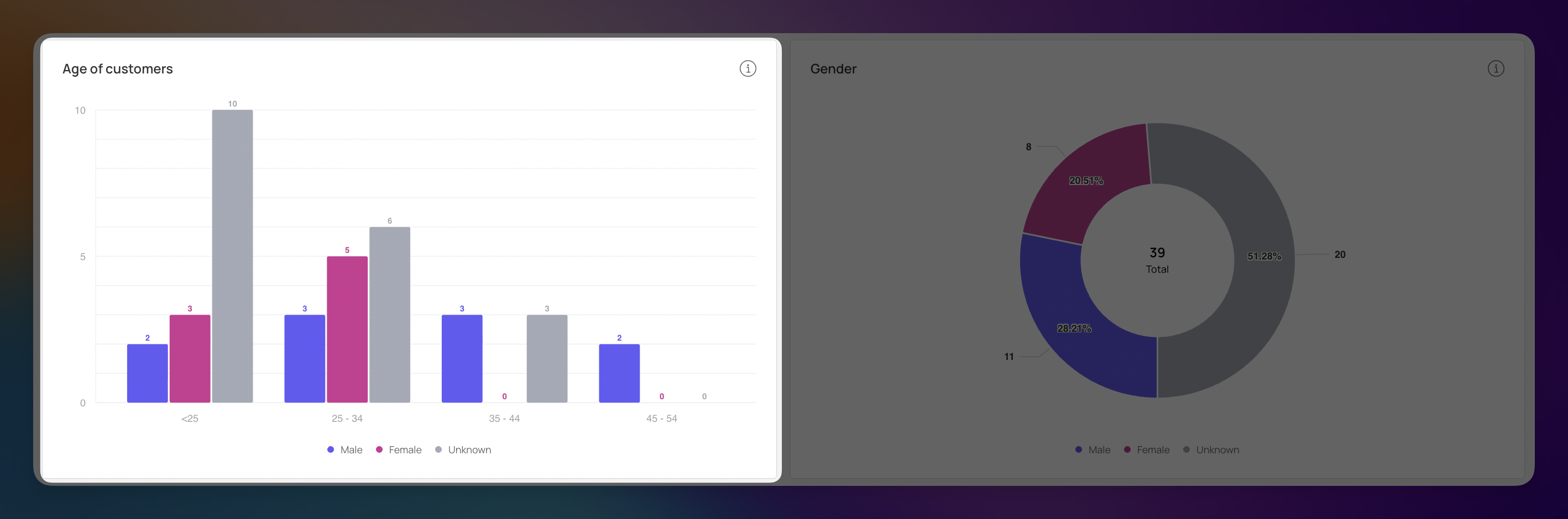
This chart categorizes your loyalty members into specific age brackets, giving you a clear picture of your most active generations.
Target Audience Identification: By viewing the distribution—such as the high concentration in the <25 and 25–34 age groups—you can see which age ranges are most attracted to your brand.
Refining Your Offerings: Use this data to adjust your product selection or reward types. For example, if your largest group is under 25, digital-first rewards or social media-driven challenges might perform better than traditional paper-based incentives.
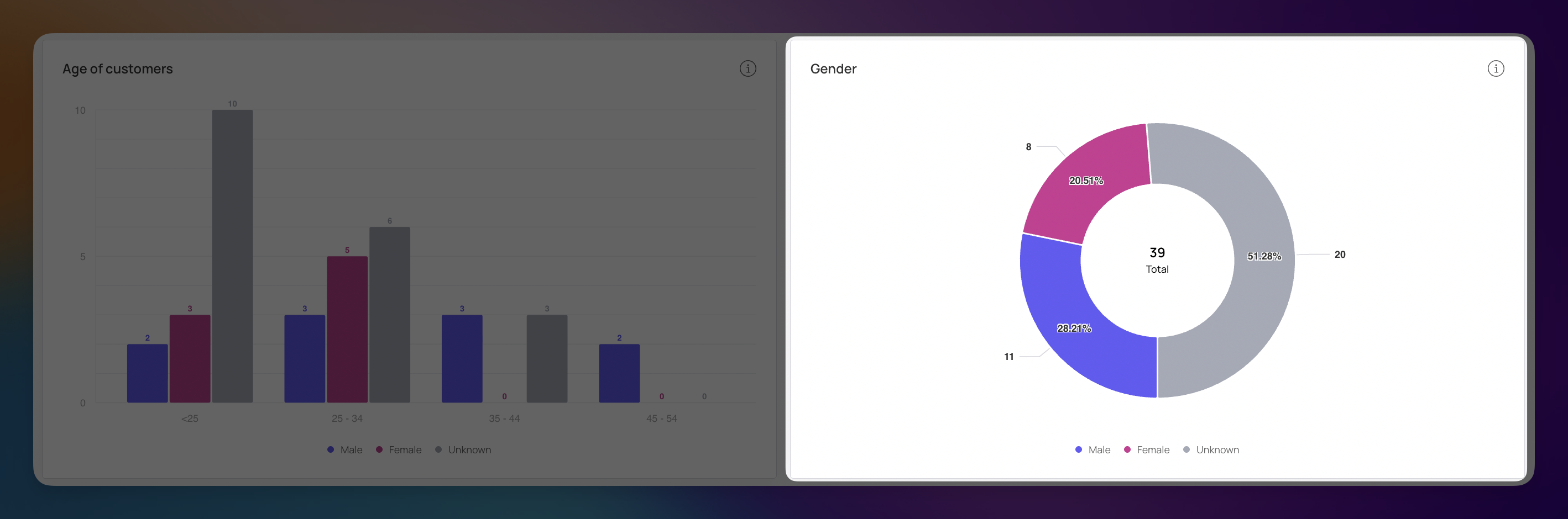
The Gender chart provides a percentage breakdown of your customer base, helping you understand the balance of your audience.
Audience Balance: The chart displays the total number of members (39) and splits them by category. In this example, the data shows 28.21% Male and 20.51% Female.
Understanding "Unknown" Data: A significant portion of your chart (51.28%) is marked as Unknown. This usually occurs when gender is an optional field during the registration process.
Strategic Marketing: Knowing the gender split of your active members helps you choose the right tone, imagery, and products for your promotional emails.
The Top 5 Members section highlights the individuals who contribute the most value to your business. By identifying these "super-users," you can better understand who your best customers are and find ways to replicate their behavior across your broader audience.
Much like the main dashboard, this section allows you to toggle between two views to see who leads in spending versus who leads in frequency.
When the Revenue toggle is selected, the list displays the five customers who have spent the most money during the chosen period.
High-Value Leaders: This view shows exactly how much your top shoppers are contributing. For example, Brad Thornbull leads the list with $900 in spend, followed by Howard Brampton at $670.
Impact Tracking: These five individuals often represent a significant portion of your total loyalty revenue, making them prime candidates for personalized "thank you" offers.
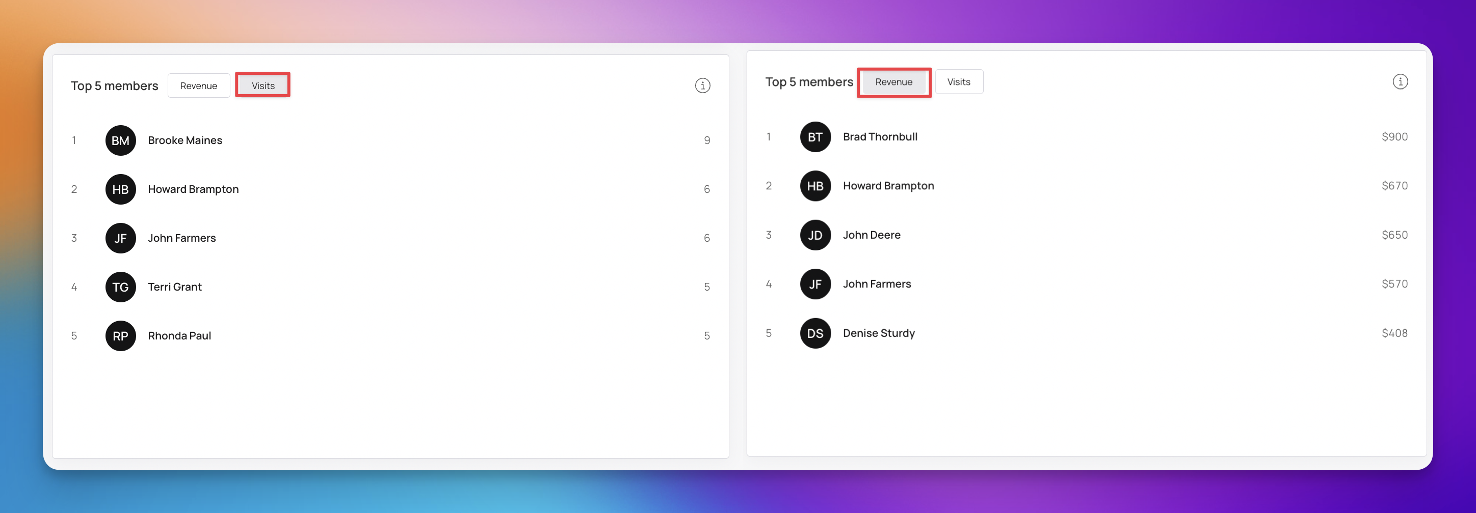
Switching to the Visits toggle reveals your most frequent visitors—those who engage with your brand most often, regardless of how much they spend per trip.
Frequency Leaders: This list identifies your most consistent fans. For instance, Brooke Maines has visited 9 times, showing a high level of brand integration in her daily or weekly routine.
Loyalty Indicators: While these customers might not always be the highest spenders, their frequent presence keeps your brand top-of-mind and provides consistent foot traffic (or web traffic).
The Reputation Management section allows you to track customer sentiment and the quality of your feedback over time. By monitoring these ratings, you can ensure your loyalty program is delivering a positive experience and quickly address any areas for improvement.
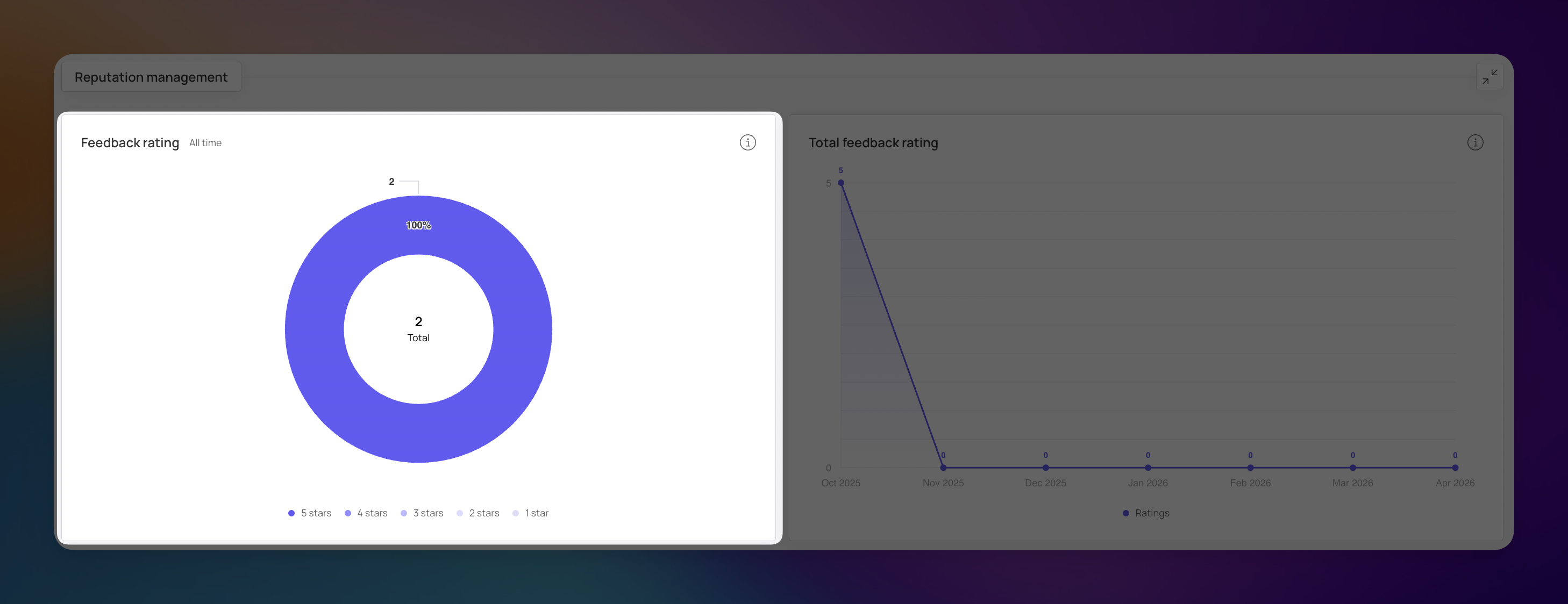
This donut chart provides an all-time distribution of the star ratings your customers have submitted. It gives you an instant visual of your brand’s reputation.
Rating Distribution: The chart categorizes feedback from 1 star to 5 stars. In this example, the data shows that 100% of your total feedback (2 ratings) consists of 5-star reviews.
Customer Sentiment: This acts as a high-level "satisfaction score." Seeing a solid block of 5-star ratings is a strong indicator that your current program and services are meeting customer expectations.
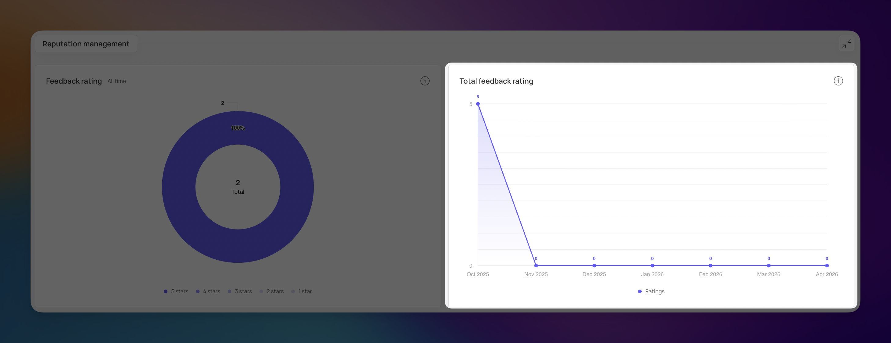
This line graph tracks the volume of feedback received over the months, helping you identify when customers are most vocal about their experiences.
Volume Tracking: The chart shows how many ratings were submitted during specific periods. For instance, there was a peak of 5 ratings in October 2025.
Consistency Check: This helps you see if your feedback collection is consistent. A flat line at zero in subsequent months suggests you may need to re-engage your customers and ask for their thoughts.
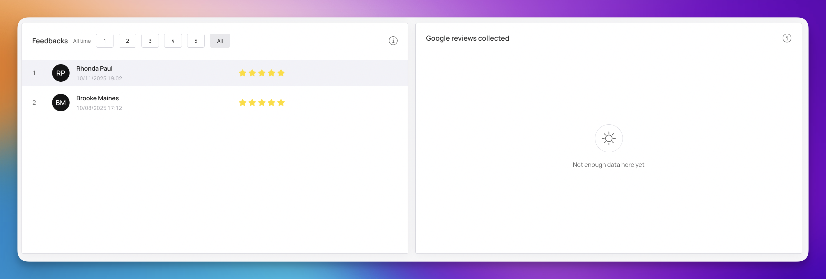
The Feedbacks list provides a detailed log of every rating submitted by your loyalty members. This is where you can see the "who" and the "when" behind your scores.
Member Identification: Each entry shows the member's name and initials. For example, you can see that Rhonda Paul and Brooke Maines both left top-tier ratings.
Timestamping: The exact date and time of the feedback are recorded (e.g., 10/11/2025 at 19:02), allowing you to link their sentiment to a specific visit or transaction.
Star Rating Filters: At the top of this list, you can filter results by specific star counts (1 through 5) or select All to see the complete history. This makes it easy to quickly find and address any low-star ratings or celebrate your 5-star wins.
This section is dedicated to tracking the reviews your business has accumulated specifically through Google.
External Reputation: While the internal feedback list tracks loyalty member sentiment, the Google Reviews section shows how you appear to the general public and potential new customers.
Data Synchronization: If the chart shows "Not enough data here yet," it simply means the integration is still gathering information or your customers haven't posted a Google review through the platform's prompt recently.
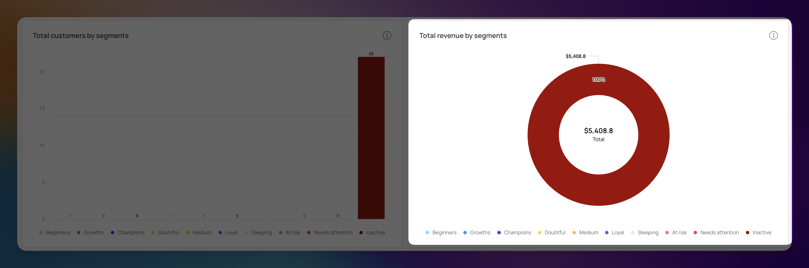
The Customer Segments section uses RFM analysis (Recency, Frequency, and Monetary value) to group your customers based on their buying behavior. Instead of looking at your audience as one large group, this section helps you see who is highly active, who is slipping away, and who has gone quiet.
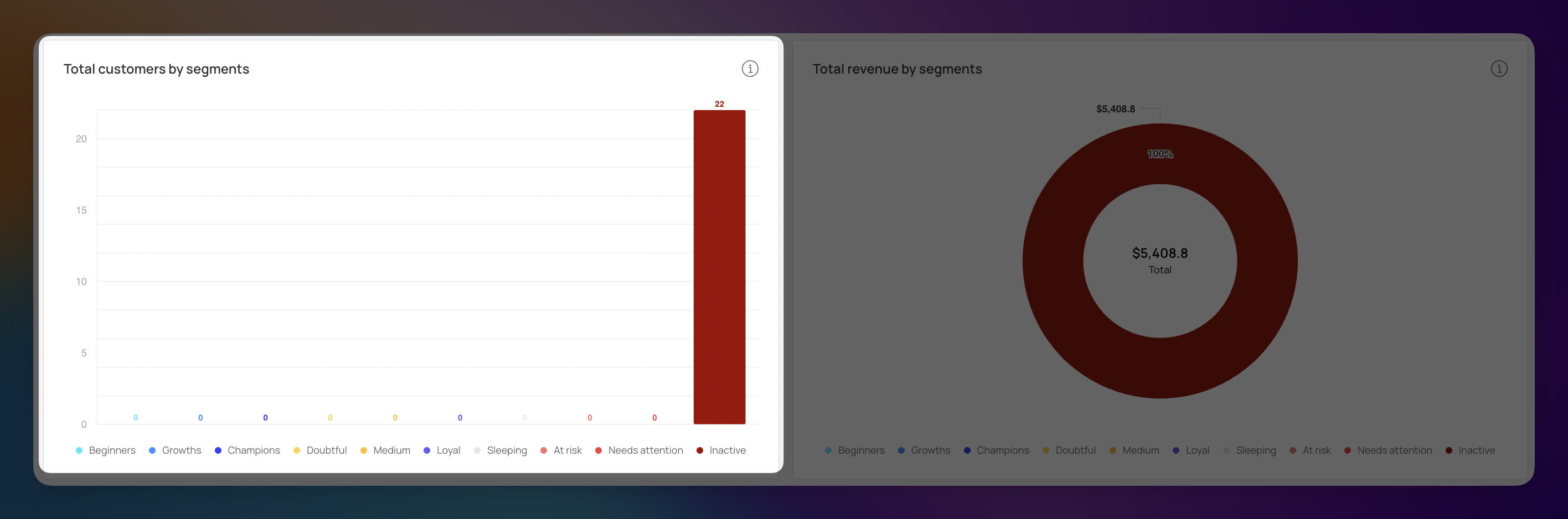
This bar chart shows the distribution of your customer base across different behavioral categories. It helps you quickly identify the "health" of your community.
Segment Categories: The dashboard tracks several stages, including Beginners, Champions, Loyal, At Risk, and Inactive.
Identifying Gaps: In this example, there is a large concentration of 22 customers in the Inactive category. Seeing this at a glance allows you to realize that a large portion of your base hasn't visited in a while.
This donut chart shows which customer groups are actually responsible for your income. It is the best way to see the financial weight of each segment.
Revenue Concentration: The chart displays the total revenue ($5,408.80) and attributes it to specific groups.
Financial Impact: Even if a segment has fewer people, it might generate the most money. In this specific data set, the Inactive segment currently represents 100% of the recorded revenue, indicating that your past big spenders have recently stopped visiting.
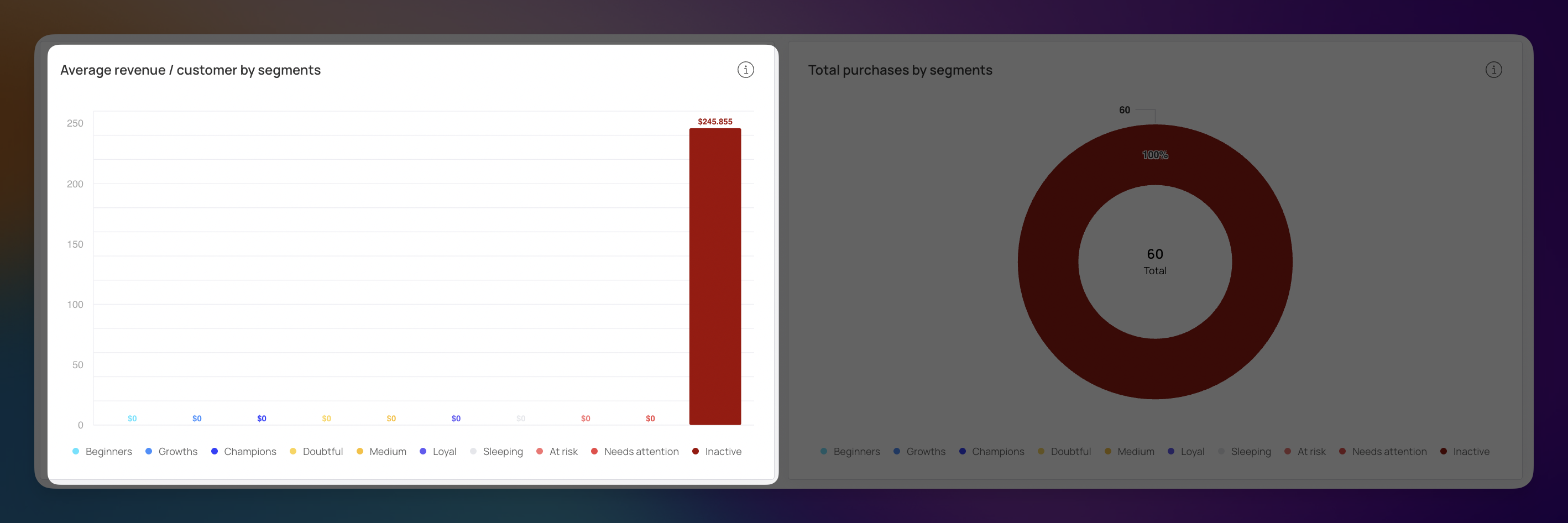
This bar chart calculates the average financial contribution of an individual within each specific group.
Segment Worth: This helps you identify which types of customers have the highest purchasing power. In the example, the Inactive segment shows an average of $245.85 per customer.
Identifying High-Value Targets: Even if a segment is currently small or quiet, a high average revenue suggests these are customers who spend big when they do engage.
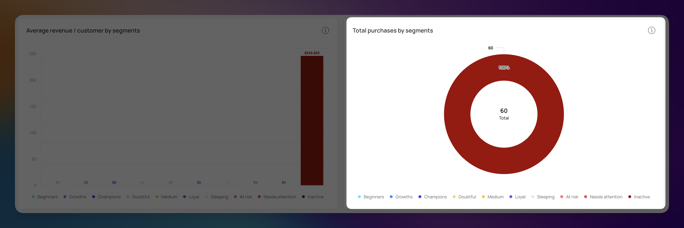
The donut chart shifts the focus from dollar amounts to transaction volume. It shows which groups are most active in terms of total orders placed.
Purchase Concentration: The chart displays the total number of purchases (60) and breaks them down by segment.
Activity Levels: In this data set, the Inactive segment accounts for 100% of the 60 total purchases. This confirms that your historical transaction volume was driven by customers who haven't returned recently.
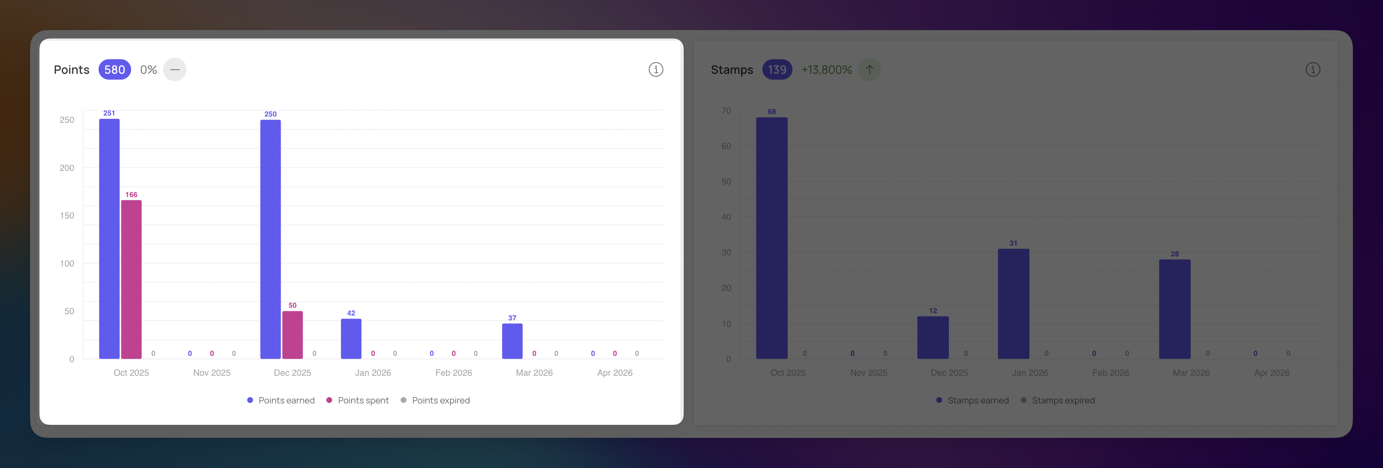
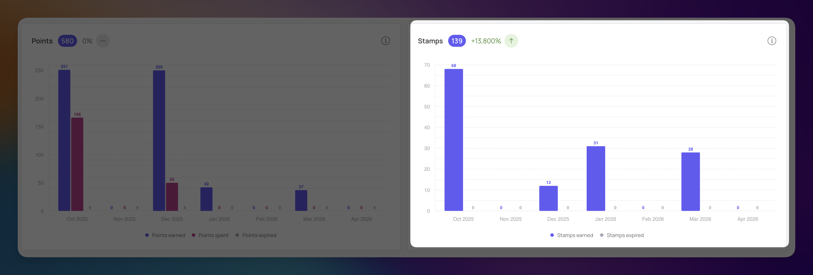
The Points Analytics section provides a clear view of how your loyalty currency is moving through your ecosystem. By tracking how rewards are earned, spent, and expired, you can determine if your customers are truly engaged or if they are simply "hoarding" points without redeeming them.
This chart tracks the lifecycle of points within your program. It is the best way to see the balance between customer earning and redemption habits.
Points Earned: The purple bars show when customers are accumulating points. For example, there were strong earning periods in October (251) and December (250).
Points Spent: The pink bars represent when customers actually use their points for rewards. In October, members spent 166 points, showing a healthy circulation of rewards.
Points Expired: The grey bars track points that were lost because they weren't used within your set timeframe.
Total Points (580): This header shows the total volume of points currently active in your program.
If your program uses a digital stamp card (like a "Buy 10, Get 1 Free" model), this chart tracks those interactions separately from points.
Stamps Earned: This tracks each time a customer "stamps" their digital card. The data shows a significant peak of 68 stamps in October, with steady activity continuing through March 2026.
Total Stamps (139): This indicates a massive growth in stamp activity (+13,800%) compared to the previous period.
Stamps Expired: Just like points, this tracks stamps that were never converted into a final reward before their expiration date.
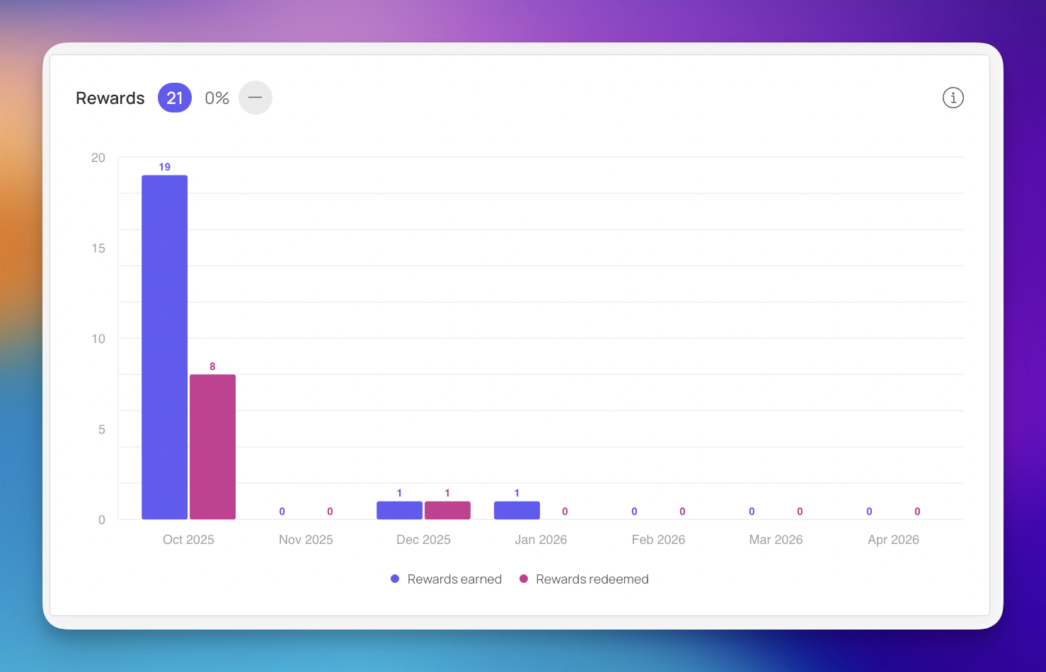
This chart visualizes the conversion of loyalty effort into real-world rewards. It allows you to track the "burn rate" of your rewards program.
Rewards Earned: The taller bars represent the total number of rewards (coupons, freebies, or discounts) that customers became eligible for during the period. In October 2025, a peak of 19 rewards were earned.
Rewards Redeemed: The shorter bars show how many of those earned rewards were actually used at checkout. For instance, in October, 8 rewards were redeemed.
Total Rewards (21): The header shows the cumulative number of rewards processed across the entire selected timeframe.

The Referral Analytics section tracks how successfully your existing customers are bringing new people into your loyalty program. This is the "viral" part of your business, where high performance indicates that your members are active advocates for your brand. The top of this section highlights four key indicators of your referral program's health:
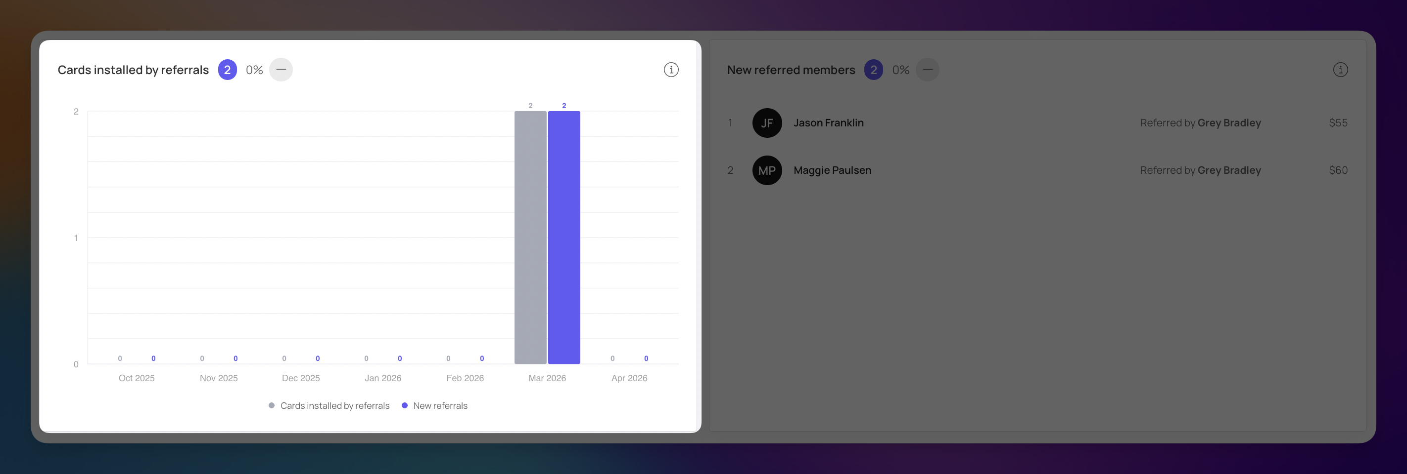
Cards Installed by Referrals (2): This counts how many new customers successfully added your digital loyalty card to their mobile wallet after being invited by a friend.
New Referred Members (2): The number of people who officially joined the loyalty program through a referral link.
Referral Conversion (100%): A standout metric showing that every person who engaged with a referral link in this period went on to become a member.
Referral Revenue ($115): The total dollar amount generated from purchases made by these new referred members.
This bar graph provides a visual timeline of when your referral activity is taking place.
Timeline Analysis: The chart tracks both "Cards installed by referrals" and "New referrals" side-by-side. In this example, you can see a clear surge in March 2026 where both metrics peaked at 2.
Growth Tracking: By monitoring this monthly, you can see if your referral program is gaining momentum or if it requires a fresh incentive to spark more sharing.
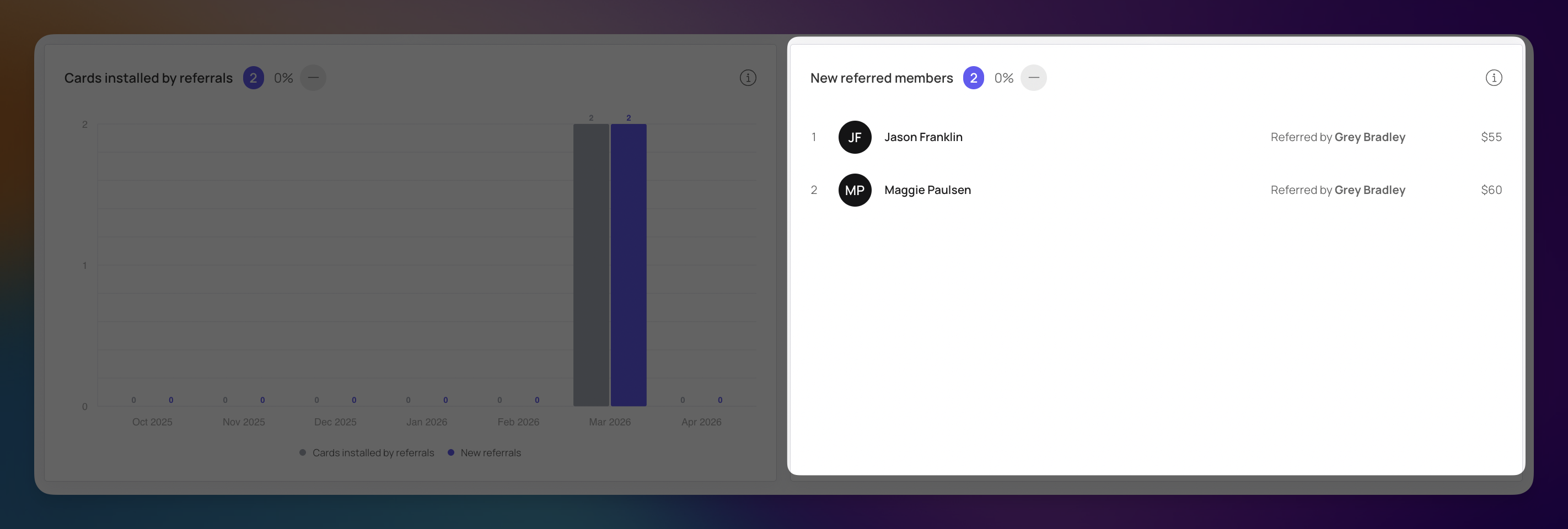
This section breaks down the data into individual relationships, allowing you to see exactly who is driving your growth.
Ambassador Tracking: You can see which of your existing members are your most active advocates. For instance, Grey Bradley is responsible for both successful referrals in this period.
Direct Impact: This list shows the immediate financial result of each referral. You can see that Jason Franklin contributed $55 and Maggie Paulsen contributed $60 to your total revenue.
The Real Timeline is a live, chronological log of every interaction occurring within your loyalty program. It provides total transparency, allowing you to see exactly how customers are engaging with your brand down to the minute. This section is an invaluable tool for auditing transactions and understanding the customer journey in real-time.
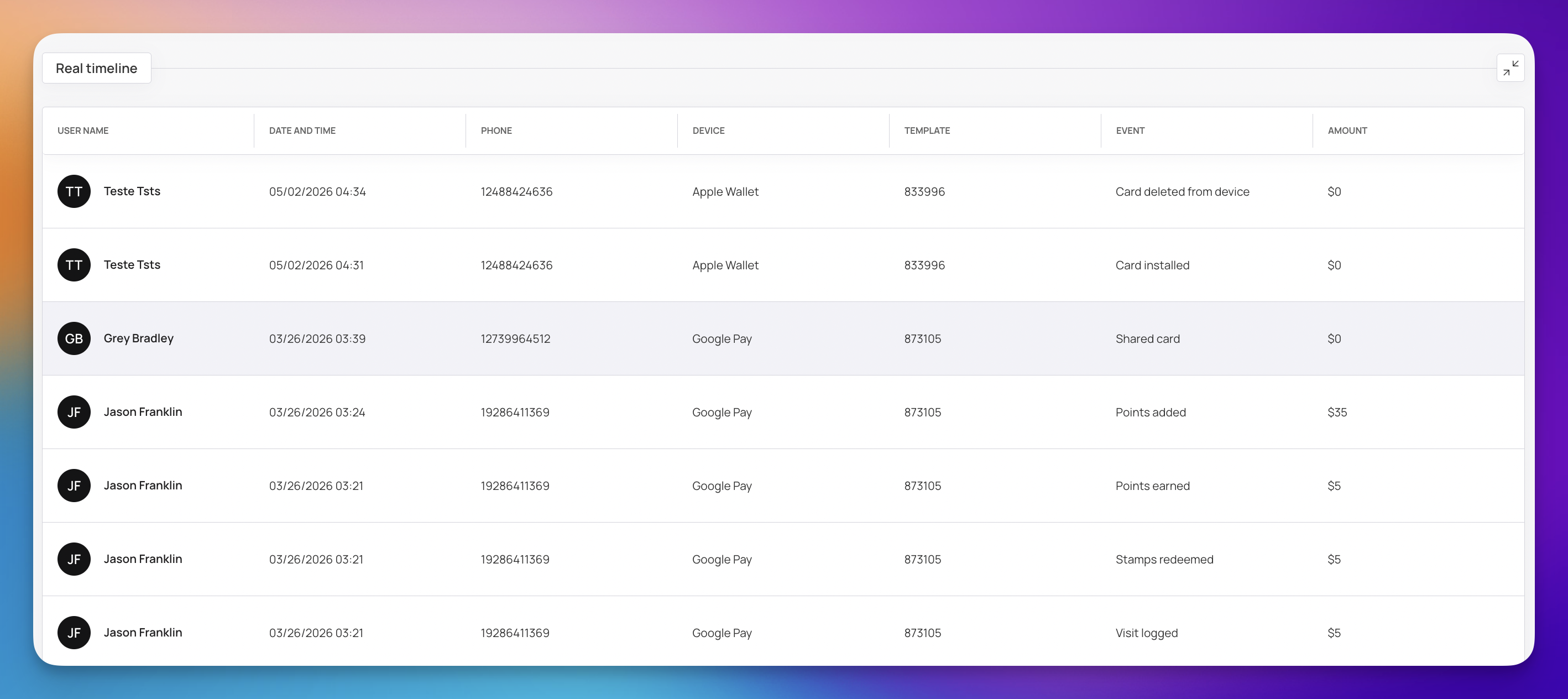
The timeline is organized into several columns to give you the full context of every event:
User Name: The identity of the customer performing the action.
Date and Time: Exactly when the interaction occurred (e.g., 03/26/2026 03:21).
Device: The platform the user is using, such as Apple Wallet or Google Pay.
Event: The specific action taken. This covers a wide range of activities, including:
Card Installed / Card Deleted: Tracking when a user adds or removes their digital card.
Points Earned / Points Added: Manual or automatic point accumulations.
Stamps Redeemed: When a user hits a milestone on their stamp card.
Shared Card: A key event that indicates referral activity.
Amount: The financial value associated with the event, such as a $55 purchase that triggered points.
The analytics provided across these sections offer a complete window into the health of your loyalty program. By moving from high-level visits and revenue down to individual customer behaviors and real-time interactions, you now have the insights needed to make data-driven decisions that move the needle.
Monitor the Trends: Always keep an eye on those dotted trend lines in the Visits and Spending charts. If they start to dip, it is your early warning signal to refresh your marketing strategy before it impacts your bottom line.
Focus on Retention: Use the RFM Segmentation and Churn Rate to identify which customers are slipping away. A well-timed "Win-Back" offer to an inactive member is often more cost-effective than acquiring a brand-new customer.
Leverage Your Advocates: Identify your "Super-Referrers" and "Top Members." These individuals are the engine of your program; rewarding their loyalty and advocacy ensures they continue to drive high-quality traffic to your business.
Listen to Feedback: Your Reputation Management data is the direct voice of your customer. Celebrate the 5-star wins, but treat every lower rating as a blueprint for how to improve your service.
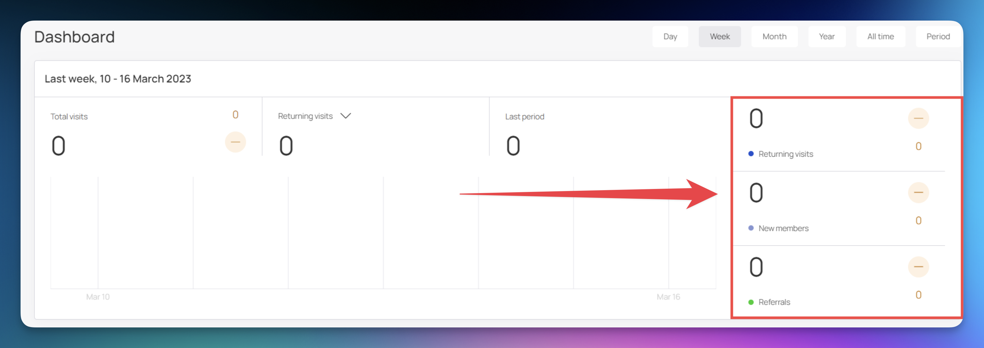
On the right side of the graph are three more indicators that include "Returning visits", "New members", and "Referrals". Each of these is displayed via a graphical representation at the center.
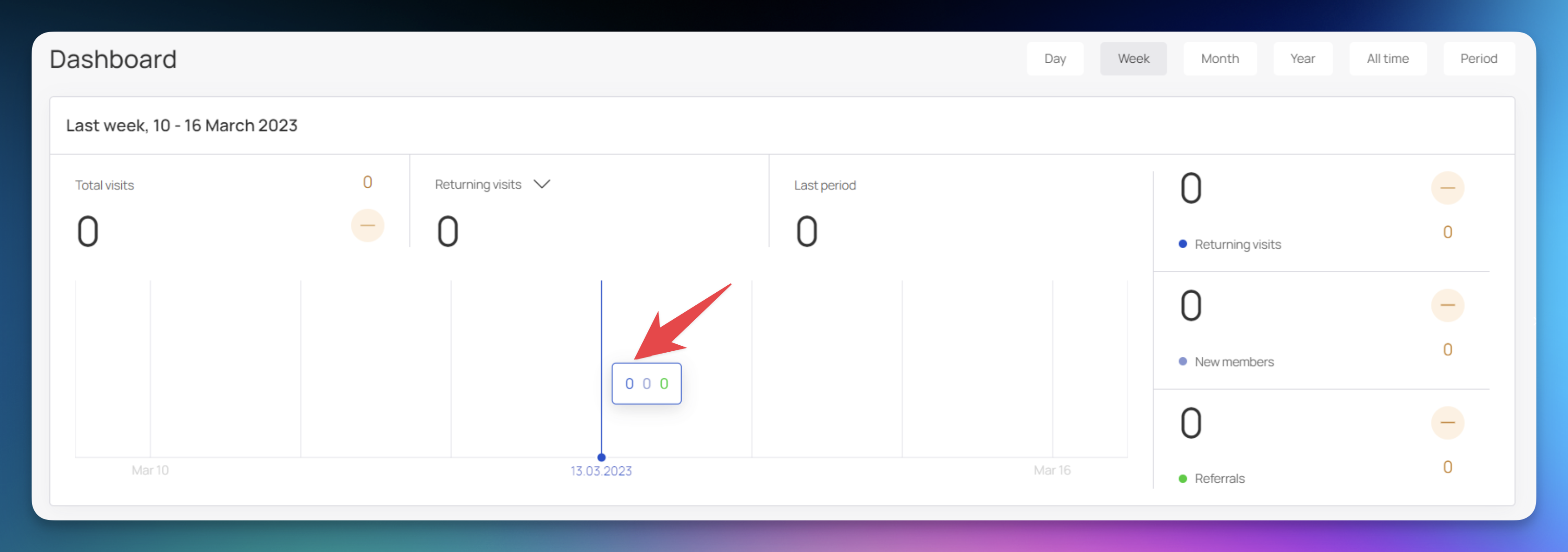
Hovering over a bar reveals a tooltip displaying the count for each indicator for the selected date. Each stat in this tooltip is color-coded for easier identification.
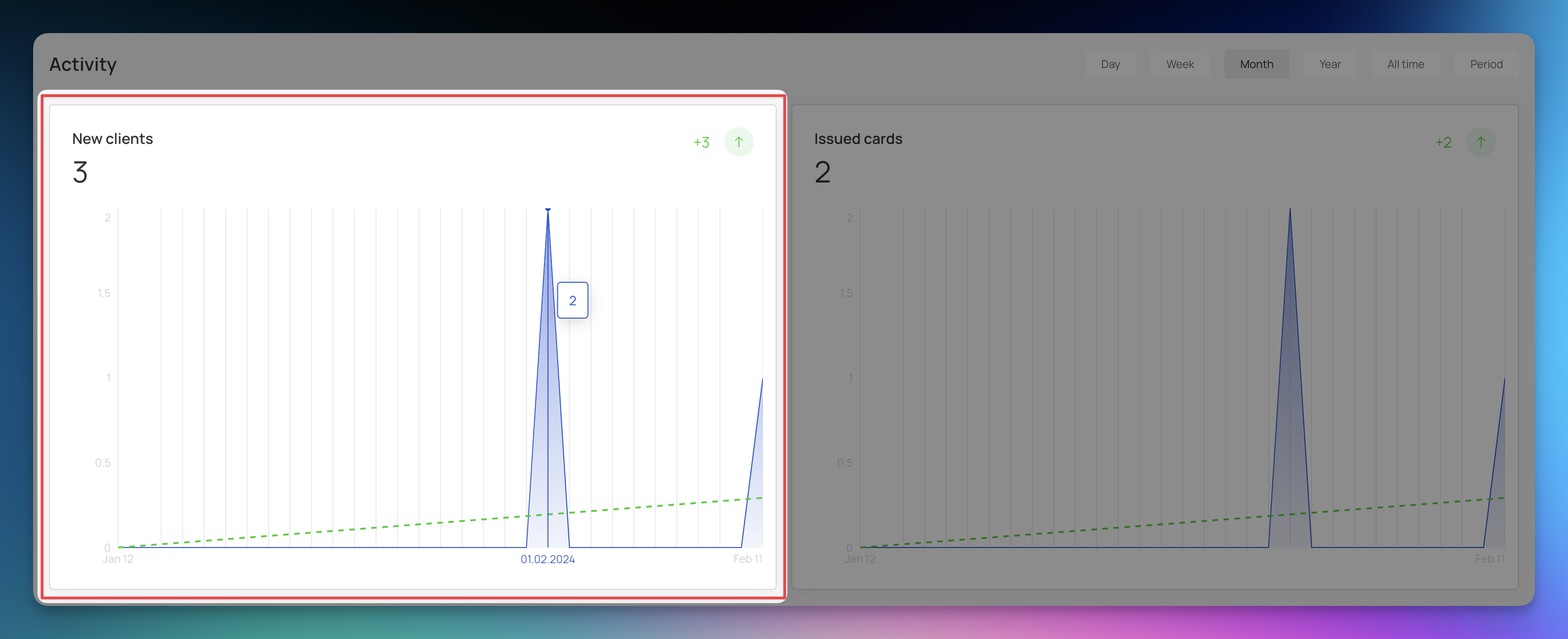
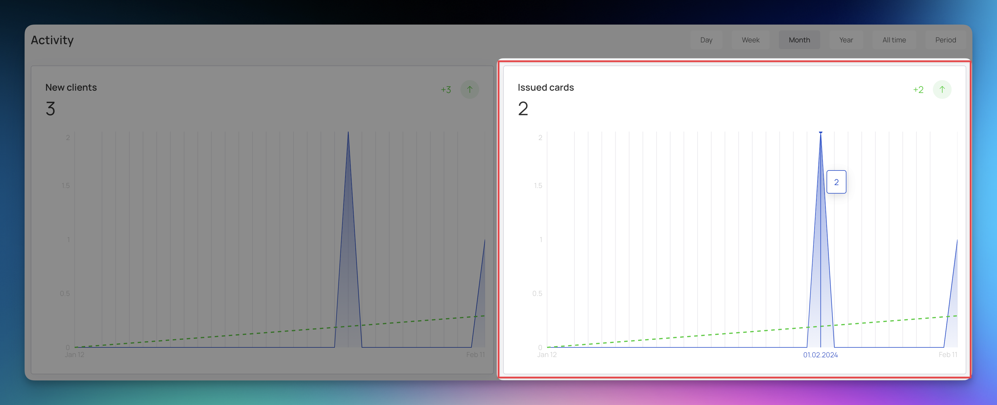
The Activity section includes a couple of graphs named "New Clients" and "Issued Cards".
The "New Clients" graph shows daily new client registered.
The "Issued Cards" graph displays the number of cards issued each day of the week.
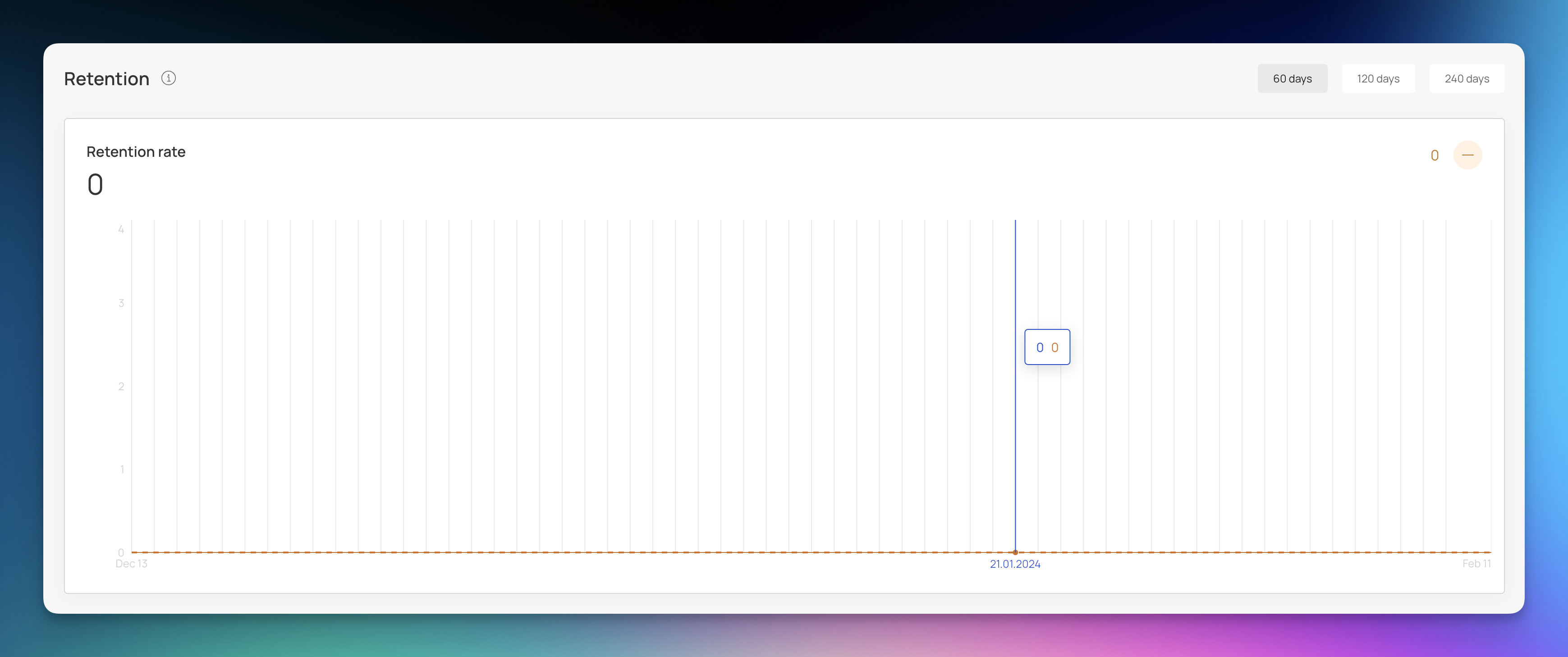
This section shows a graph of the "Retention Rate", which tracks customer retention over 60, 120, and 240 days.
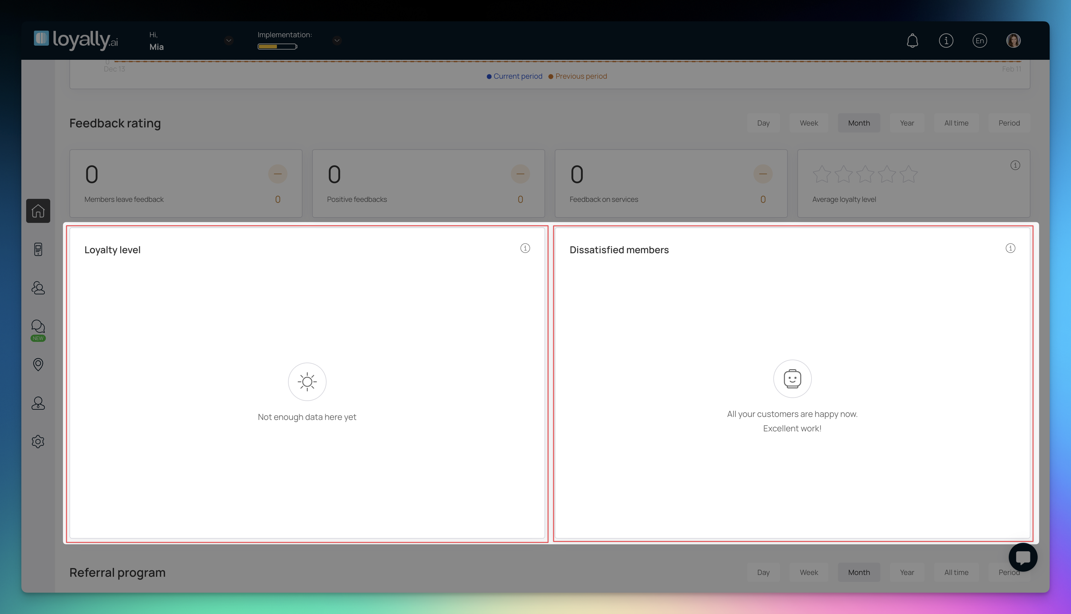
The "Feedback Rating" section displays the satisfaction level of your customers.
Displayed are number counts for:
Members leave feedback
Positive feedbacks
Feedback on services
Average loyalty level

Displayed are graphs showing the "Loyalty Level" and "Dissatisfied members" for a selected time duration.
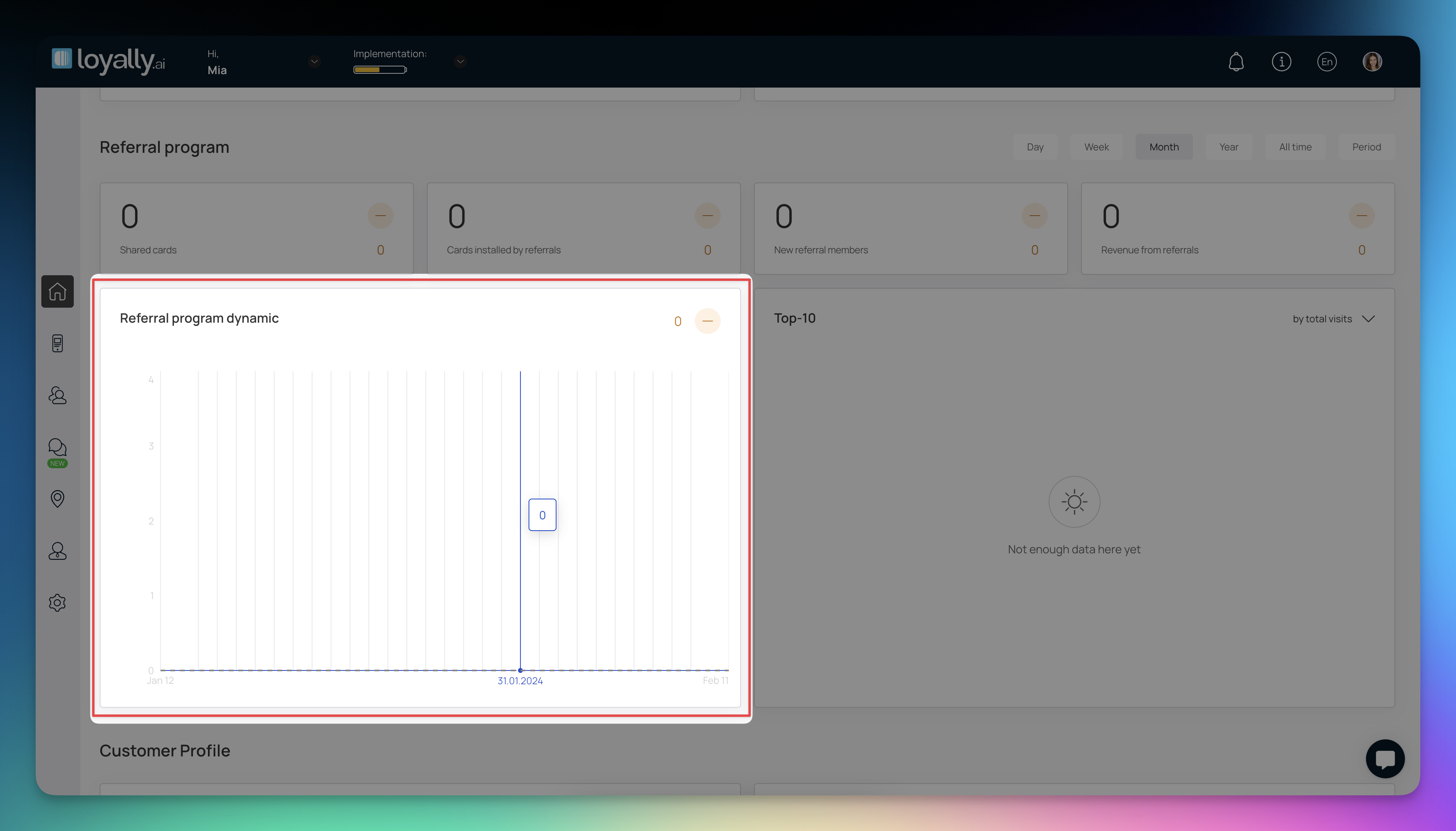
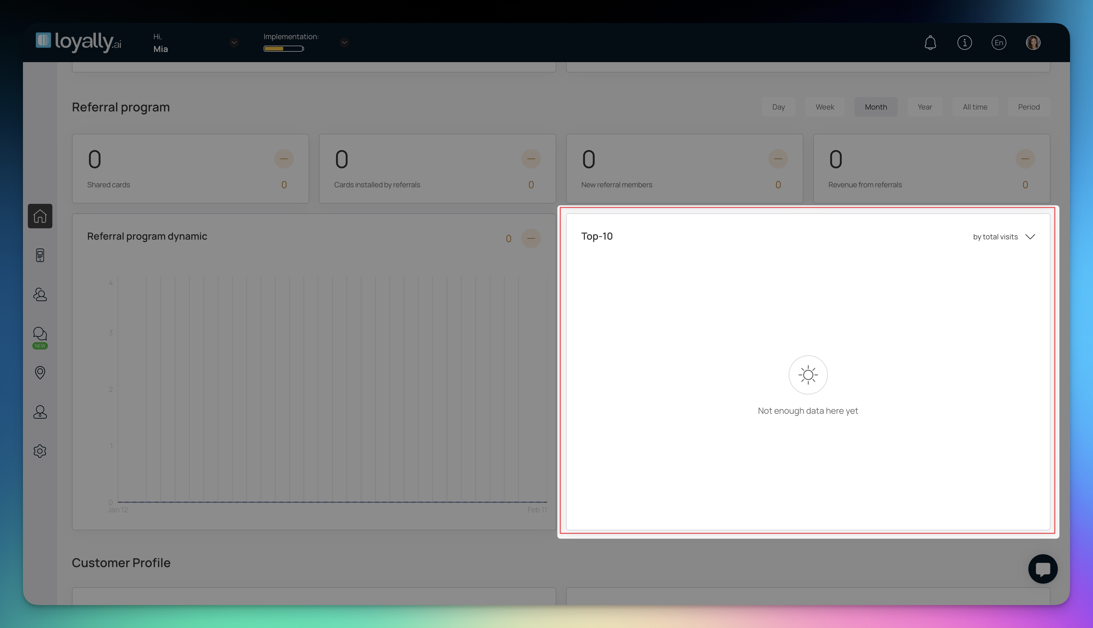
The "Referral Program" section displays the referral program status of your customers. Showing all relevant statistics related to your business's referral program.
"Shared Cards" tile displays the number of cards customers have shared as referrals during the selected period.
"Cards installed by referrals" tile displays the count of cards installed by customers via a referral.
"New referral members" tile shows the number of members who joined through referrals within a specific timeframe.
"Revenue from referrals" tile displays the revenue generated from referrals.

The "Referral program dynamic" graph shows the program's performance per day of the week.
The "New referral members" graph shows the number of new members referred each day of the week.
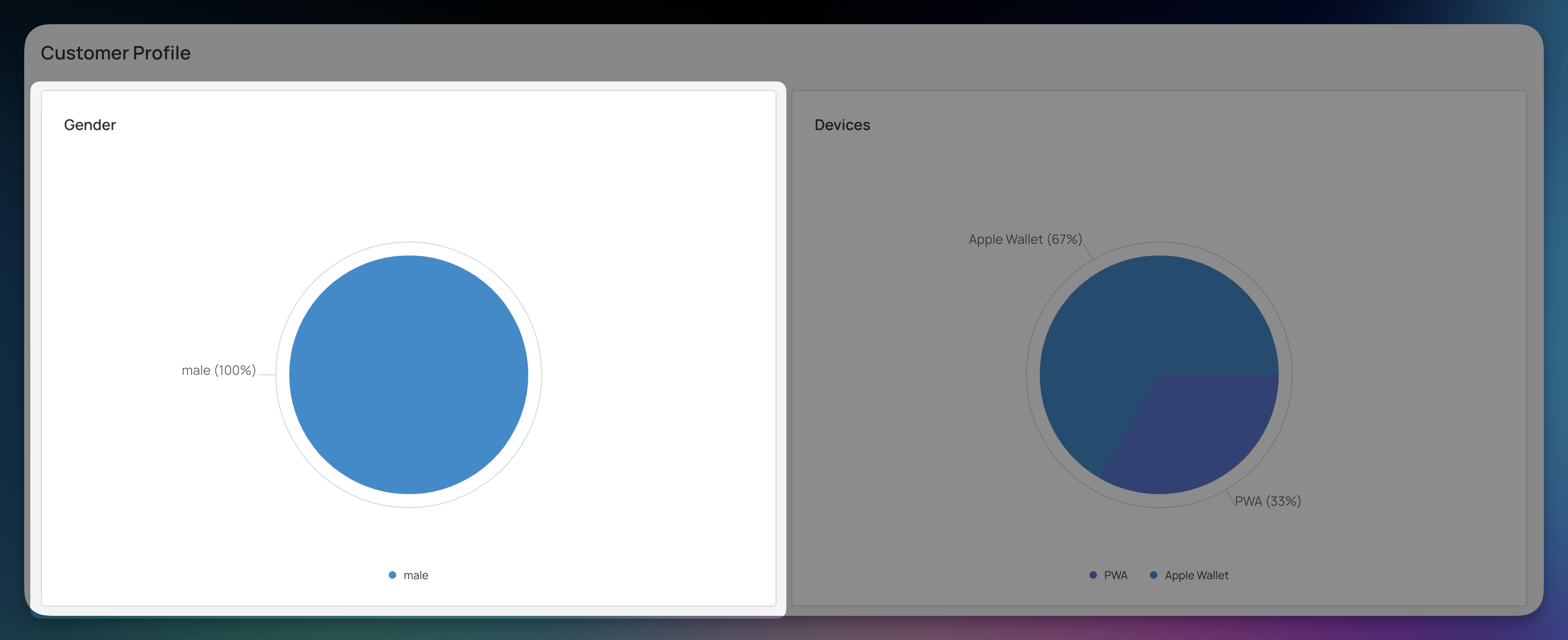
This section offers insights into current customer profiles for your business.
The "Gender" pie chart shows the distribution of customer profiles based on gender.
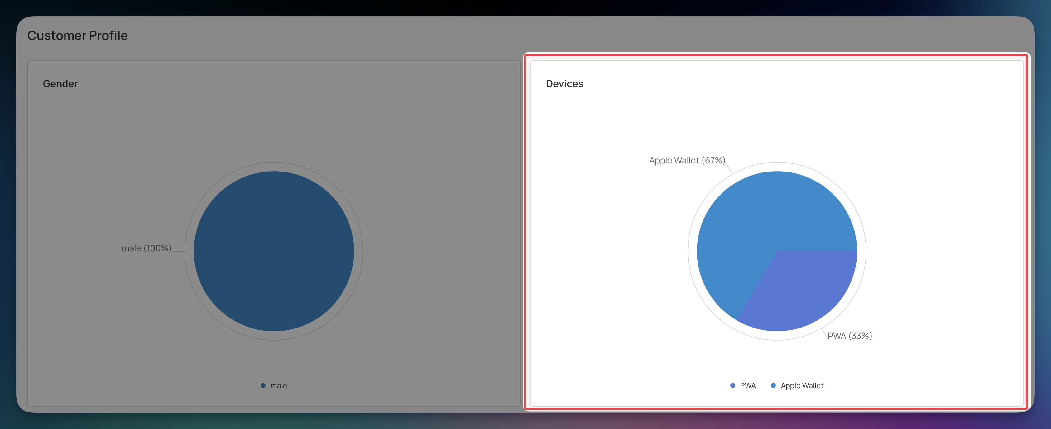
The "Devices" pie chart shows how customers used different devices to add loyalty cards.
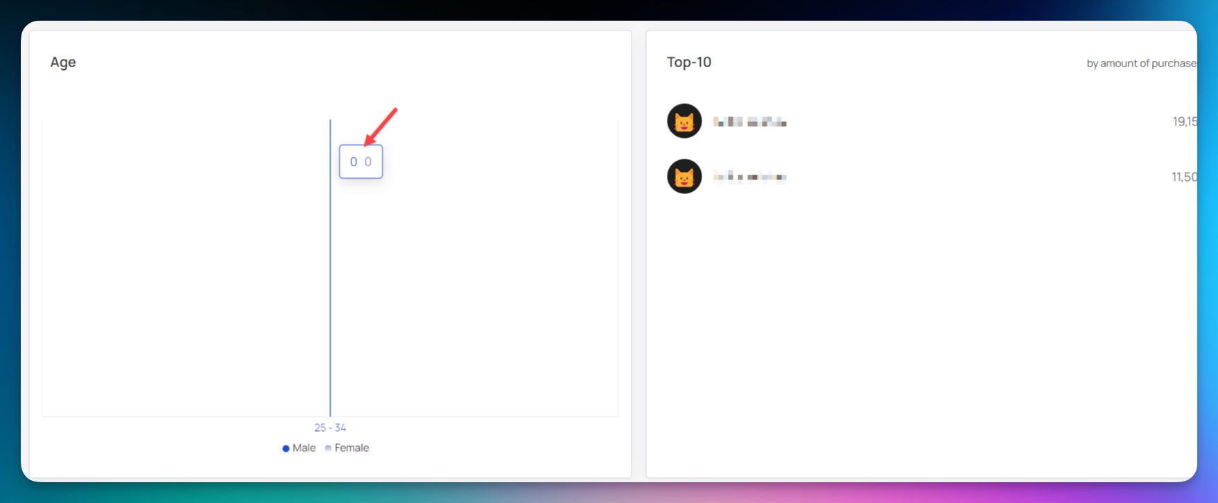
The "Age" graph shows customer profiles in different age ranges with colors indicating gender.
Quick Start Guide
Learn how to start your digital loyalty program with Loyally.ai